Uncategorized

Artist Spotlight – Graham Falk

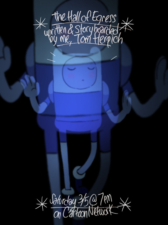
Graham Falk is an interesting case – he originally joined the series for some guest board work during season five for Shh! and Root Beer Guy. In most instances, guest board artists will work on a few episodes before moving onto other projects, or simply as a one-time opportunity, like Kris Mukai and KC Green. However, Falk continued to work on the series sporadically throughout season 6 and 7, until he became a fulltime regular for season 8 and eventually even boarded the very final scene for the original series finale. There’s a lot of unique attributes to Falk’s role in the series, first being that unlike a good majority of the staff, he’s a seasoned veteran in the animation world. While most artists have a few previous gigs under their belts, Falk’s career in animation dates back as early as 1980, working as a layout artist and character designer, among several other roles for many successful animated shows. Falk even had his very own series, Untalkative Bunny, which ran for three seasons. Falk’s cartoonish style and love for classical animation can easily be seen in his work, which translates into his time on Adventure Time.

Art Style

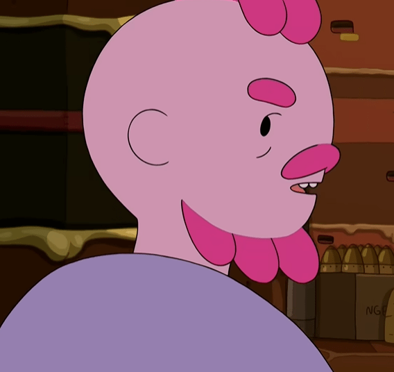
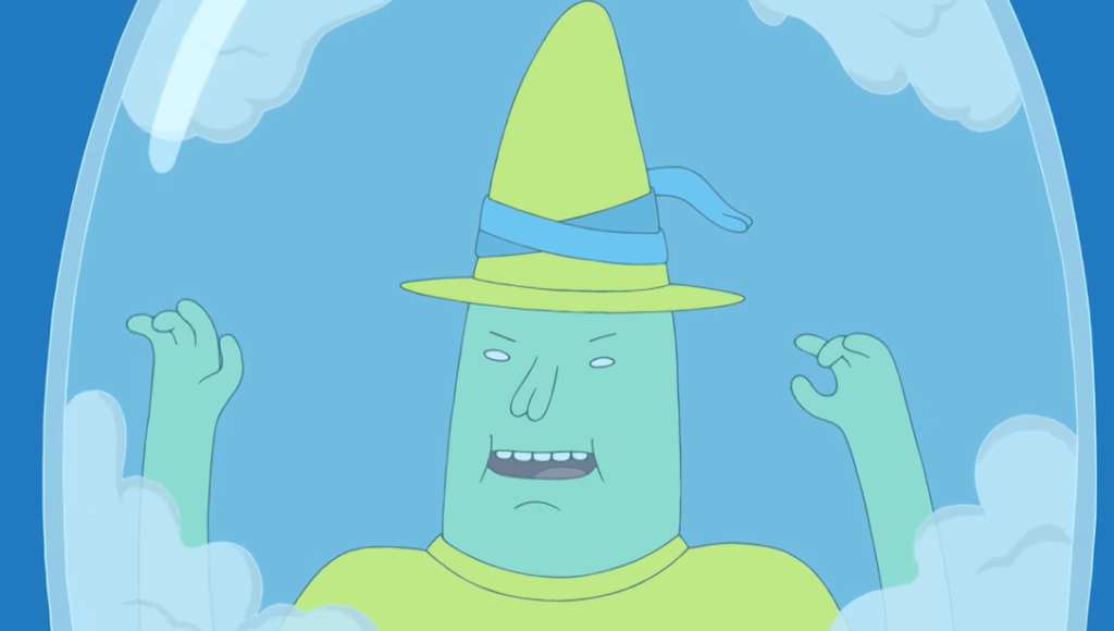
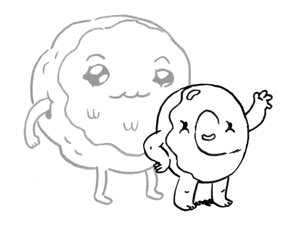
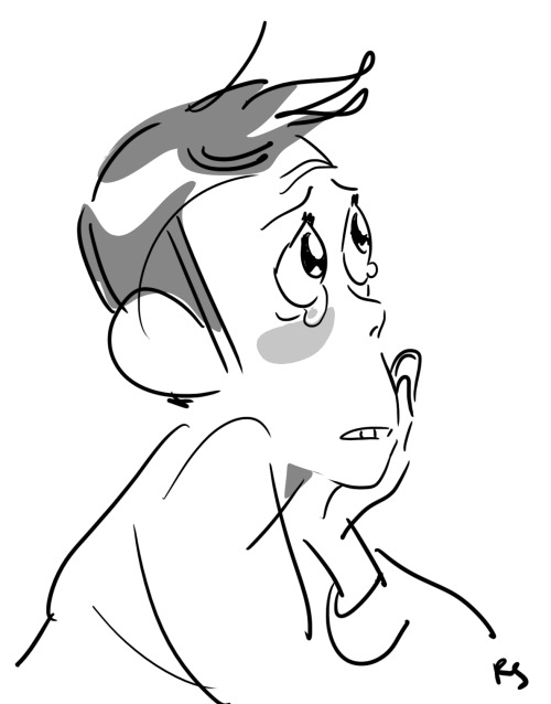
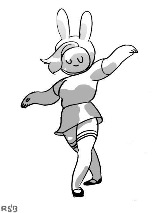
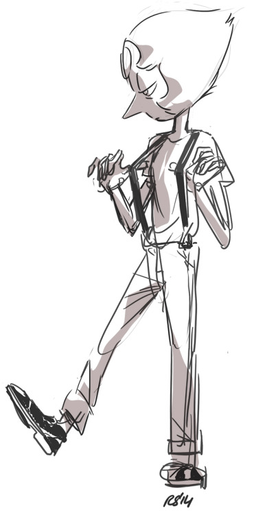
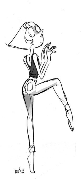
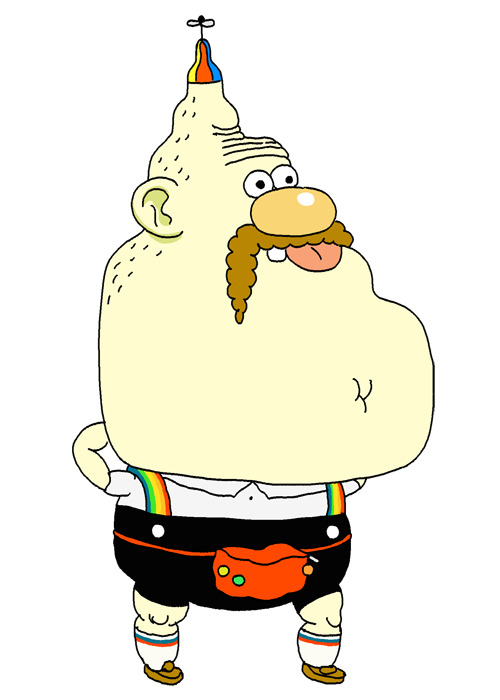
Falk is somewhat of an enigma when it comes to locating his artwork. He doesn’t seem to have an online presence or portfolio, which tracks since he’s had such a longstanding career even before the presence of the internet. If it’s not evident enough by these screenshots, Falk’s main inspiration point in both art and storytelling is that of silent cartoons from the 1920’s and very early 1930’s, most evident in his series Untalkative Bunny and his design work for Over the Garden Wall. Dumb, silly expressions, stretched facial features, oval eyes, tilted line-of-action, dramatically big mouth emotes, and monobrows are all hallmarks of Falk’s touch. A lot of those same idiosyncrasies can be found on Summer Camp Island. For as unique as Falk’s touch is, some of his episodes for both Summer Camp Island and Adventure Time can look pretty standard and difficult to decipher, until one expression comes along that can easily be pointed out as a Falk drawing.
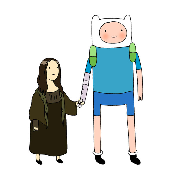
Finn & Friends

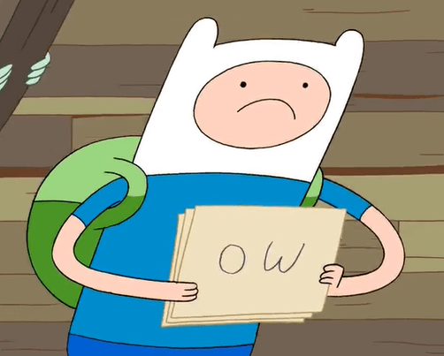
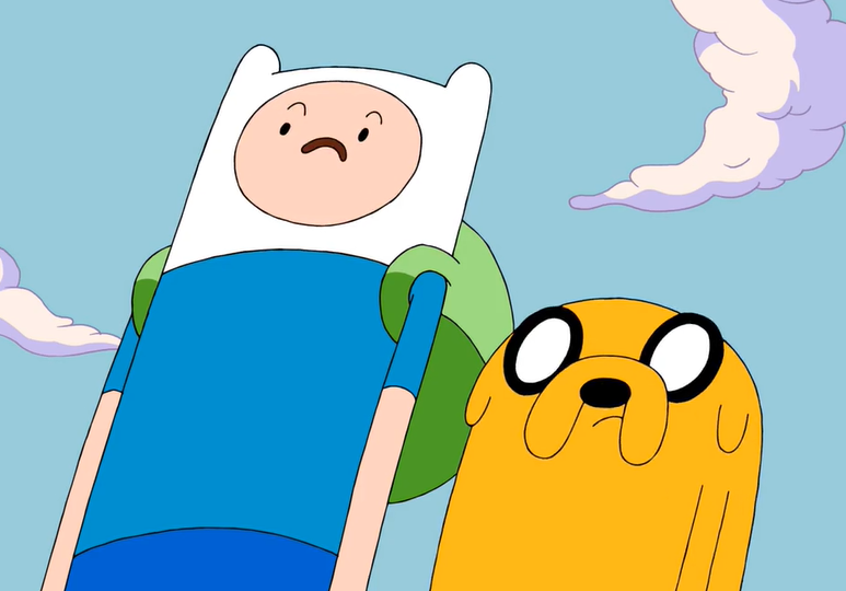
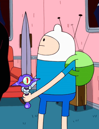
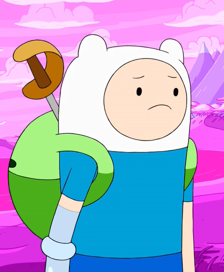
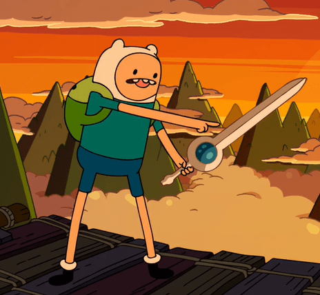
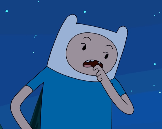
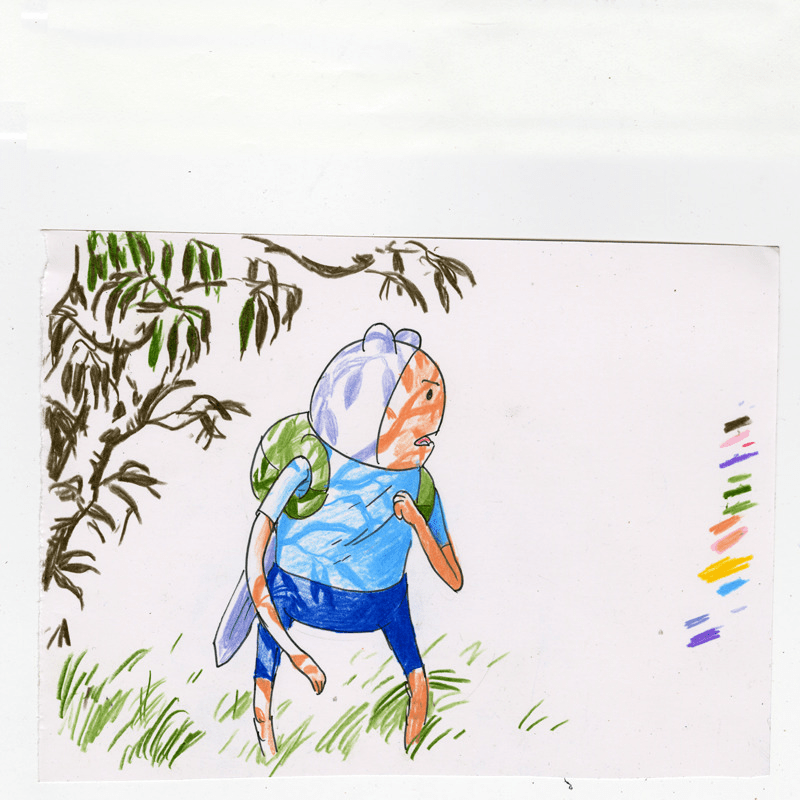
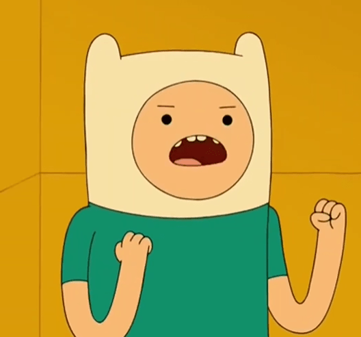
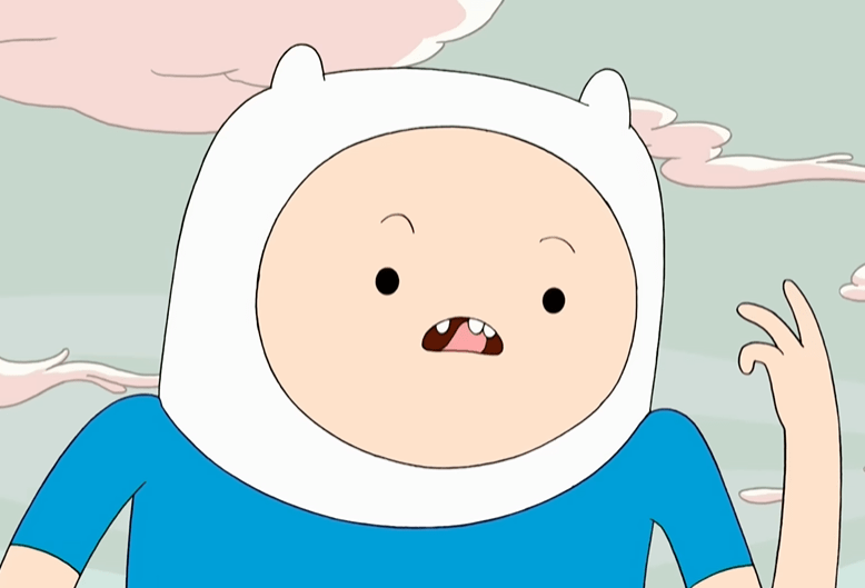
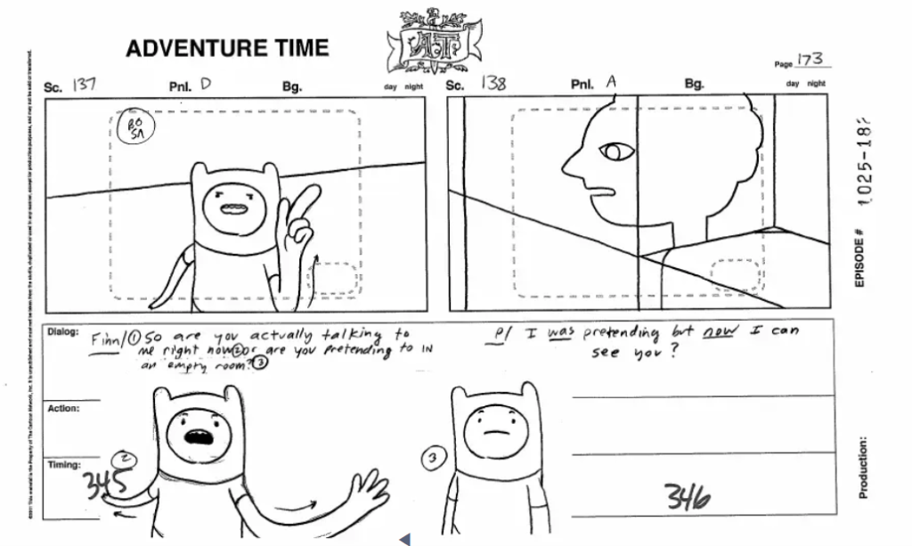
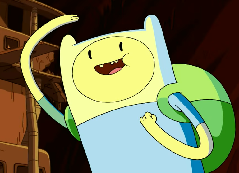
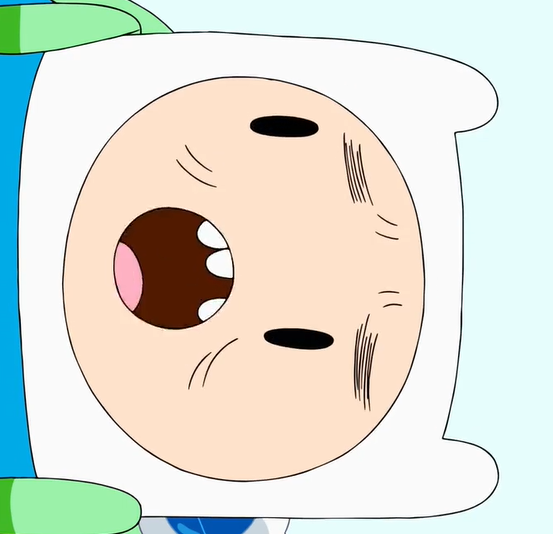
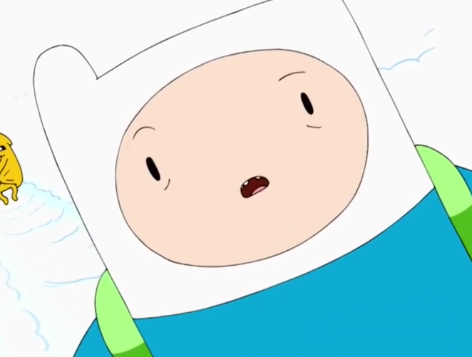
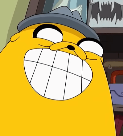
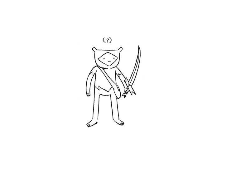
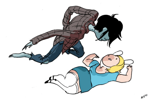
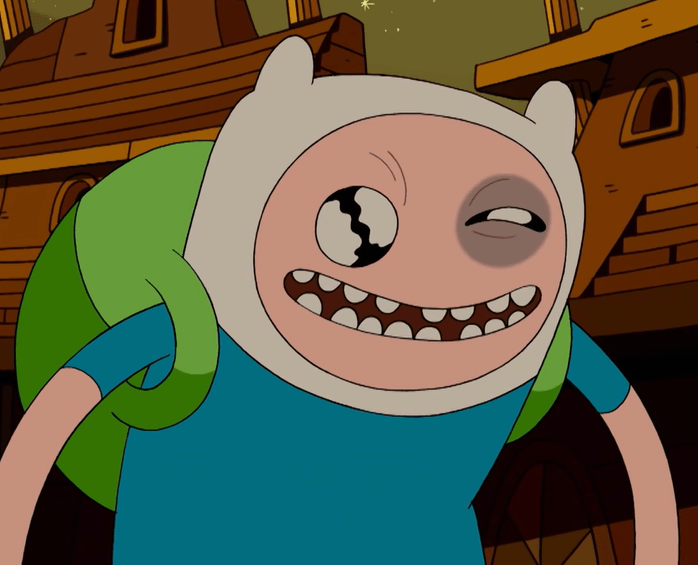
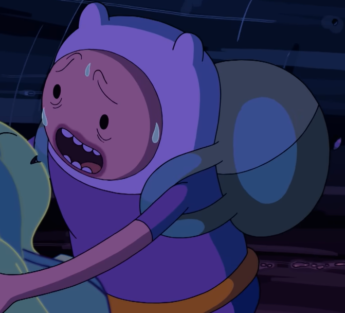
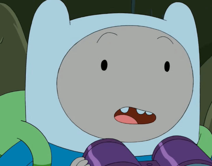
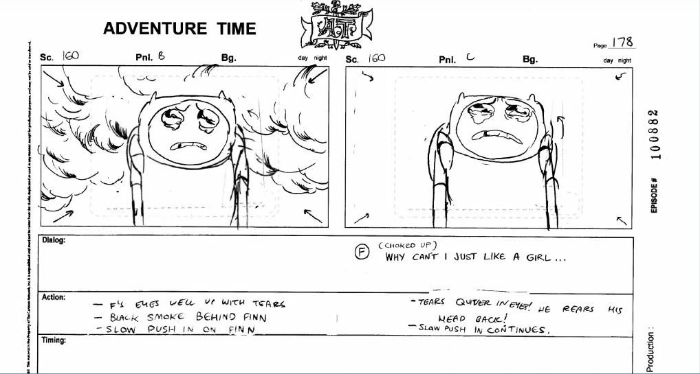
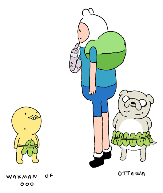
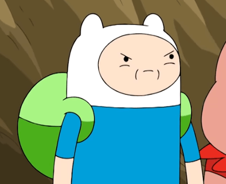
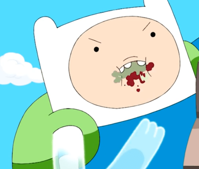
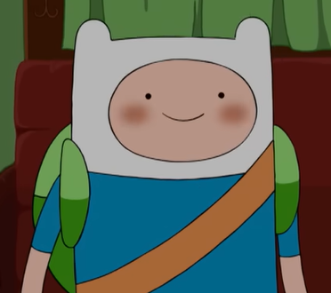
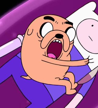
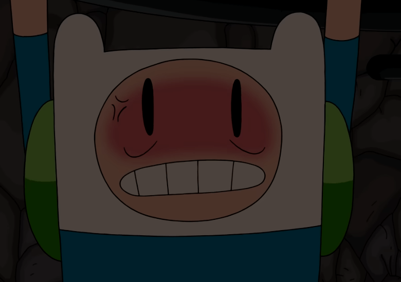
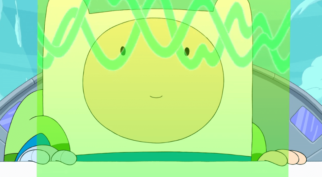
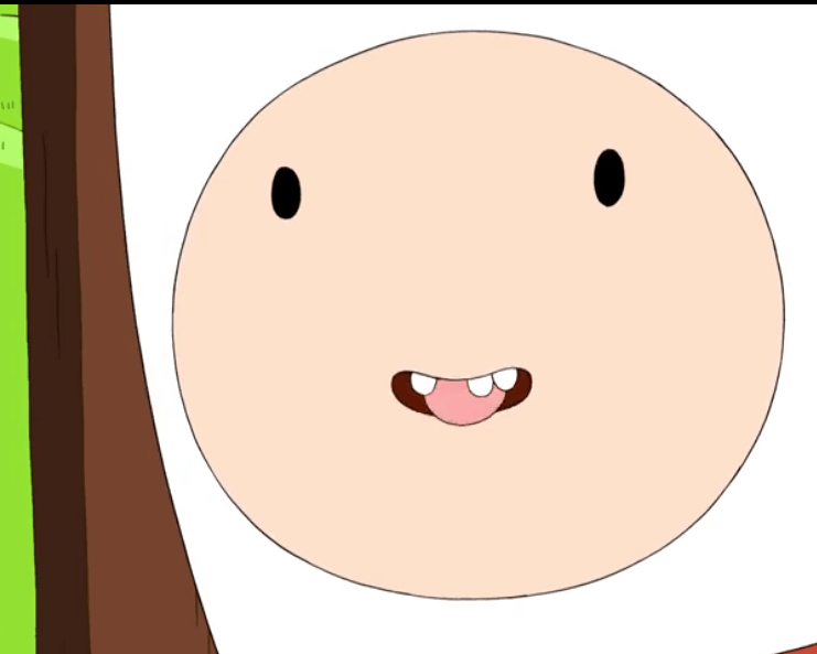
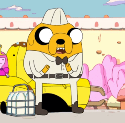
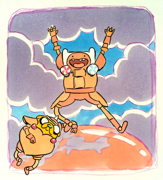
This one was difficult because there’s Falk hallmarks that are found across every character, and then there’s just the way that Falk draws Finn specifically – I tried to settle for a combination of both. Something very common in Falk’s posing is the 70ish degree angle that characters will stand at, as seen in images one through four. Expressions will additionally be slightly crooked, with boomerang-esque shapes, shown in Finn’s expression in image three. Expressions will also be quite large, specifically in the mouth. Falk Finn’s will be seen with huge, teethless smile, or big frown-y scowls, seen in images four and five. More standard shots of Finn from Falk actually hearken back to his earlier model sheet look, a departure from the more modernized look that most storyboards artist had adopted by the final season, which can be seen in image six. And, while most artists at the time were competing for who could draw the largest eyes on Finn, Falk’s eyes are maybe some of the smallest. Falk also likes drawing Finn in sideview perhaps more than any other artist, as seen in images three, seven, eight, and nine.

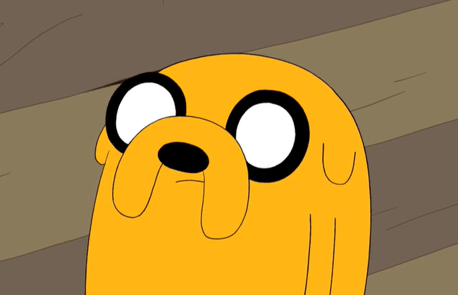
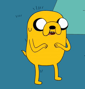
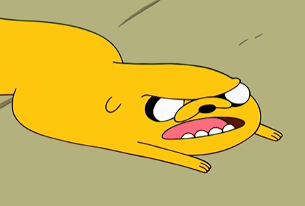
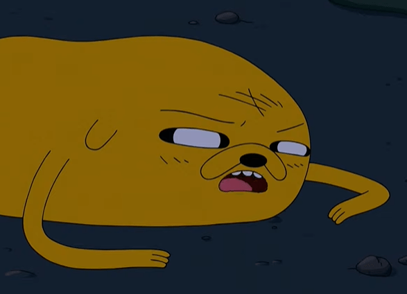
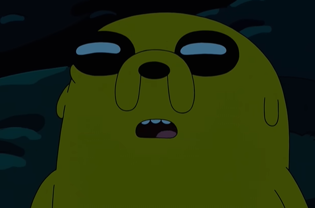
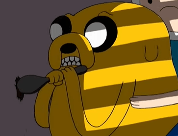
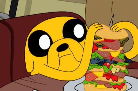
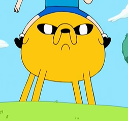
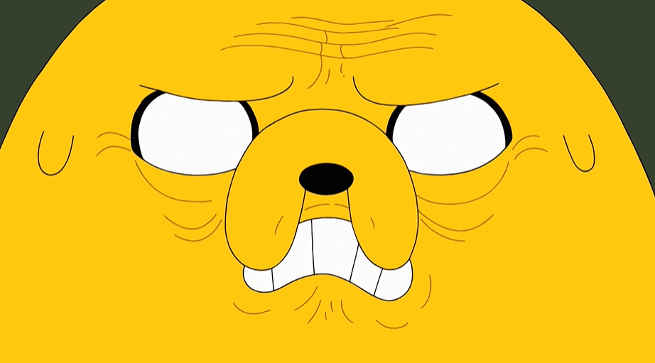
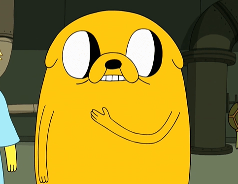
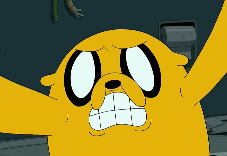
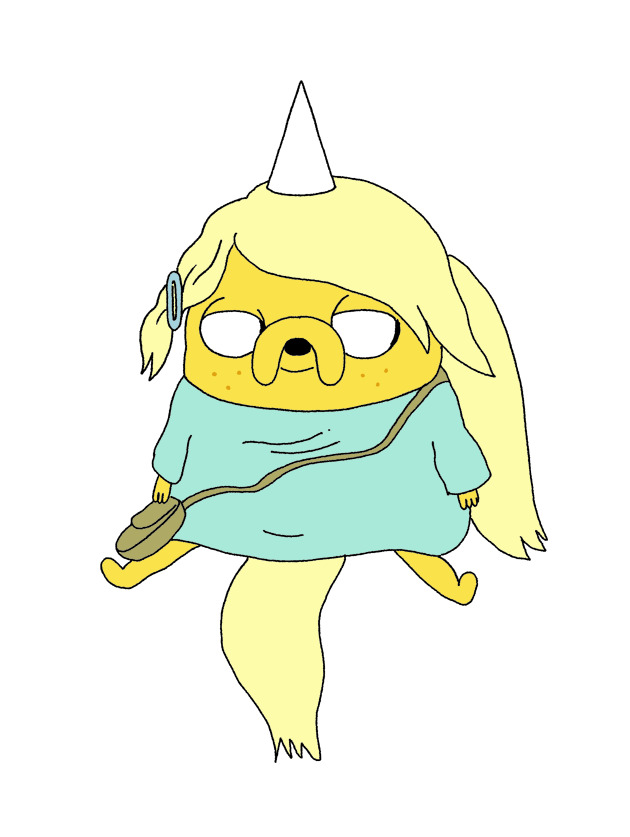
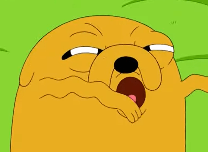
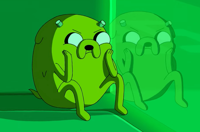
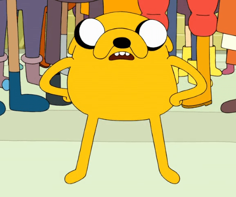
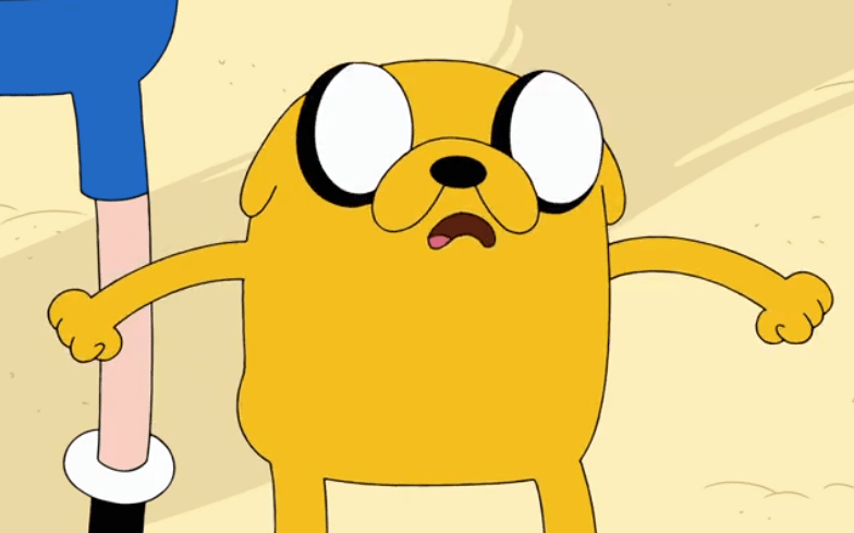
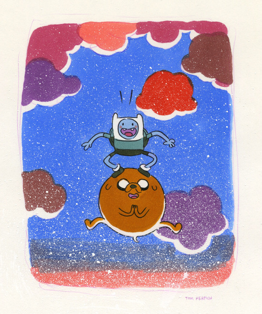
A lot of Falk’s touches for Finn also impact Jake: dramatically angled posing, wackier-than-usual expressions, a focus on sideview shots. Jake also suffers a similar fate as Finn, with Falk’s style being somewhat conformed in the final season and less of his touch being evident, as seen with the model sheet-esque Jake in the ninth image. I love how Falk draws Jake’s eyes, with the whites taking center stage and the black mildly outlining them. Falk Jakes also occasionally have mouths that don’t connect all the way to his jowls, as indicated in the first and second images.

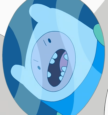
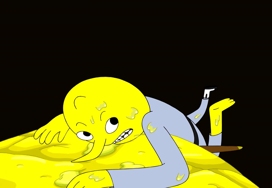
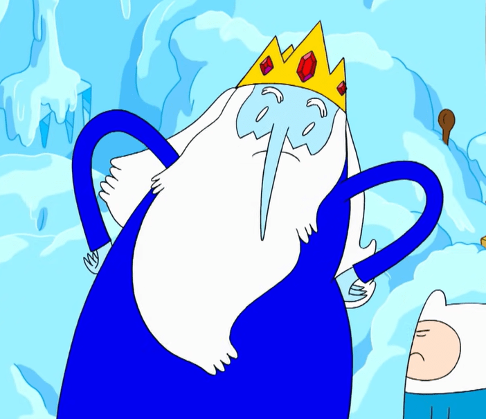
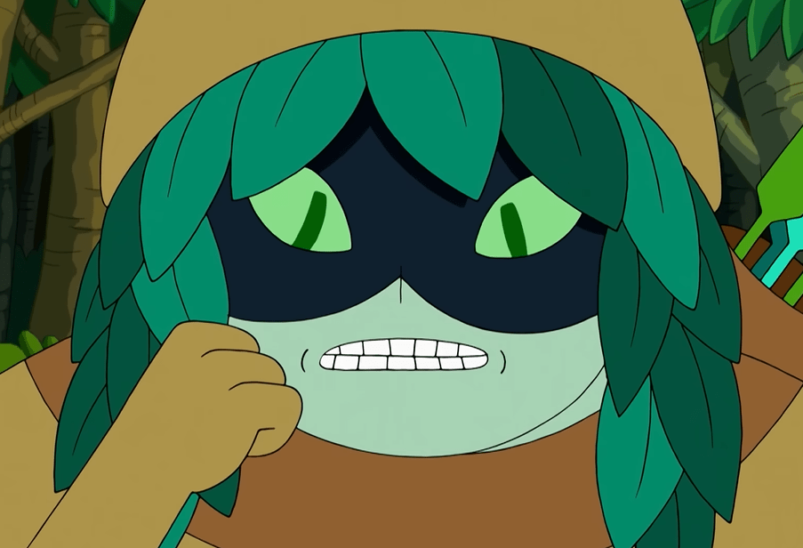
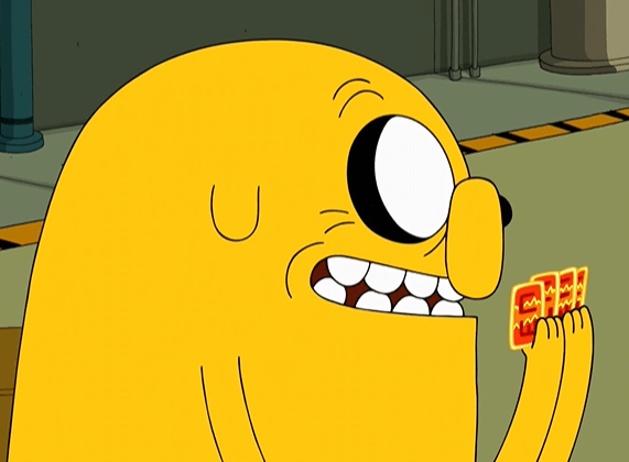
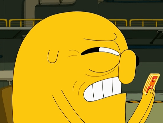
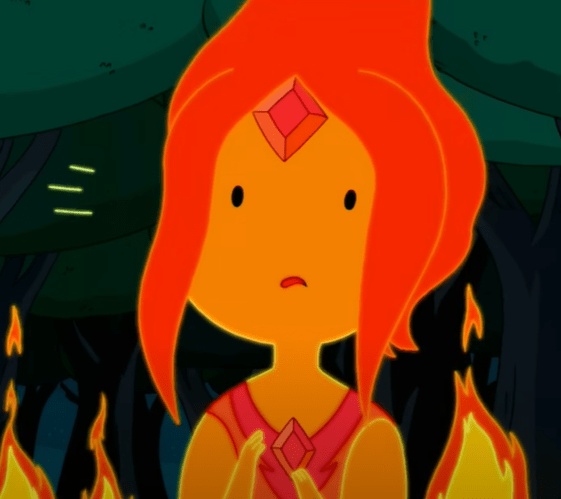
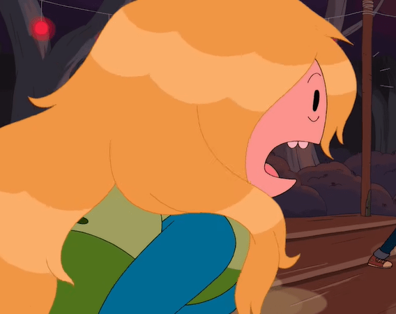
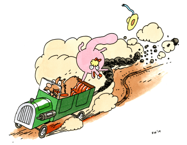
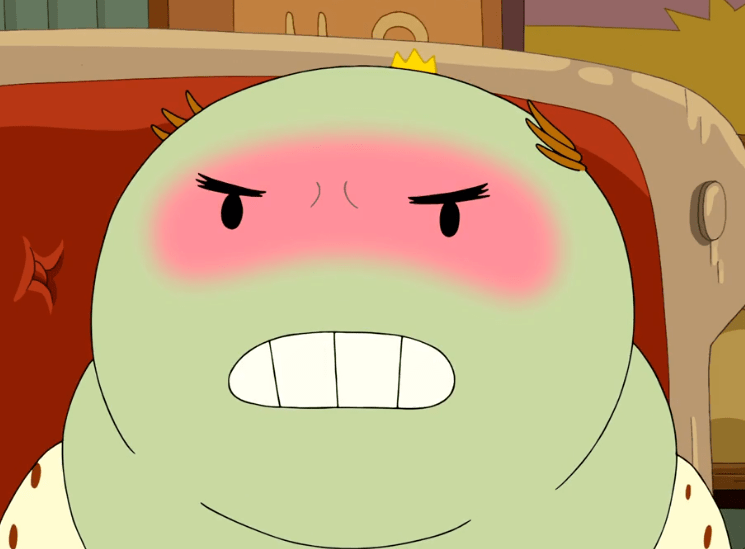
A handful of Falk specialties. Monobrows, extreme angled posing, big frowns and smiles, eyes with thick, black outlines, and sharper-than-usual edges on mouths.
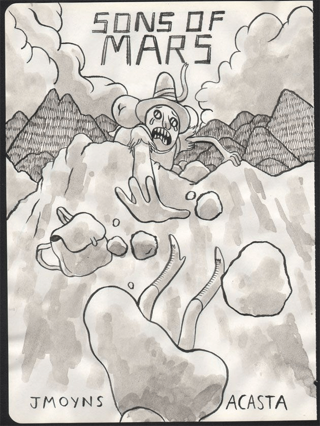
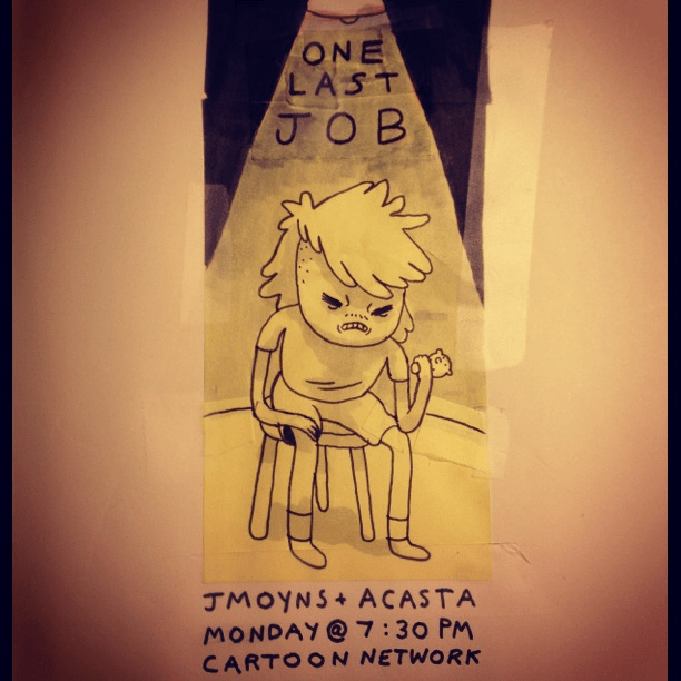
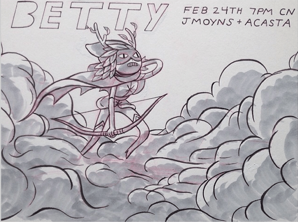
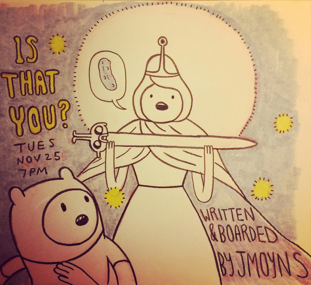
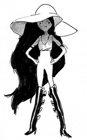
Promo Art

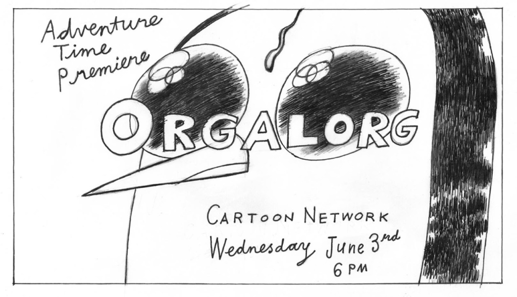
Some of the few pieces of AT promo art that Falk has whipped up, including a paper plate canvas for Sad Face.
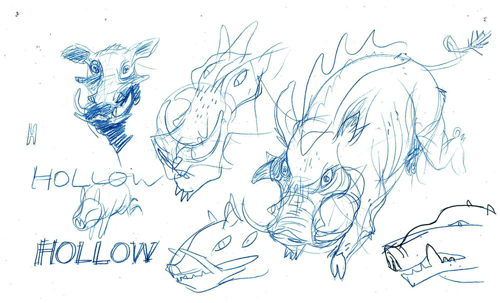
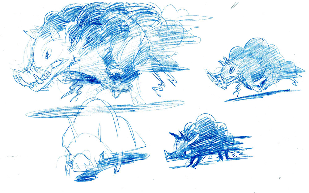
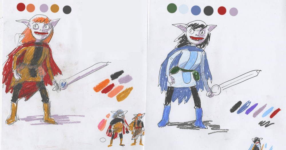
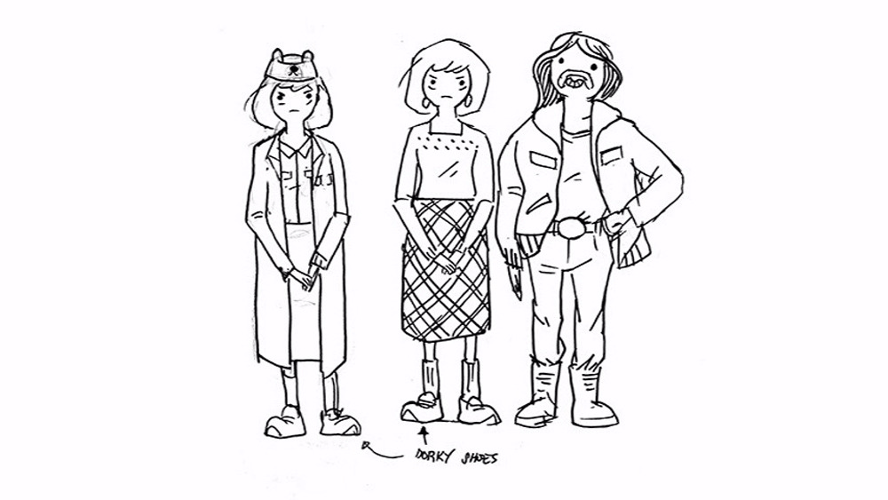
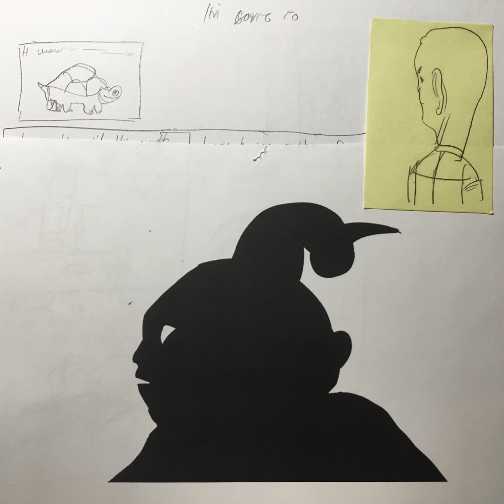
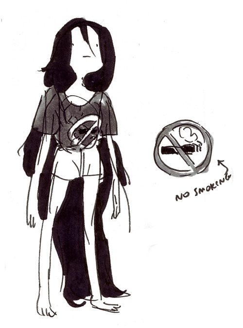
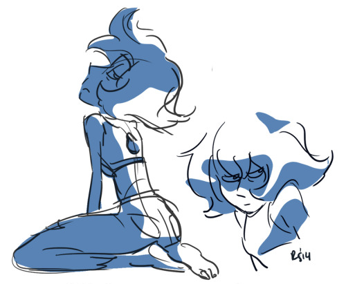
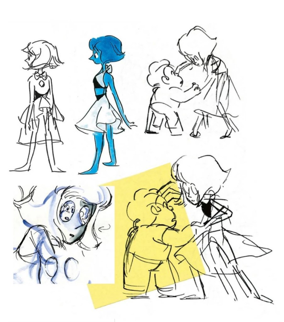
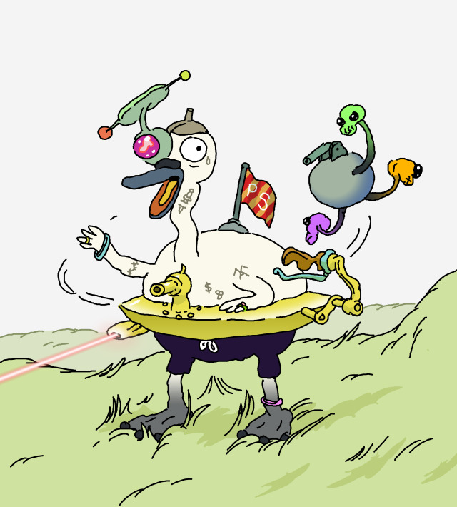
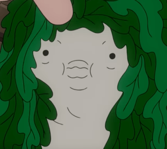
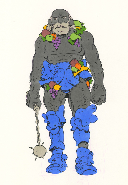
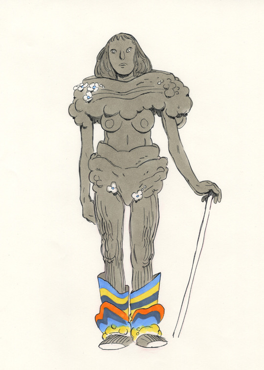
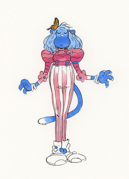
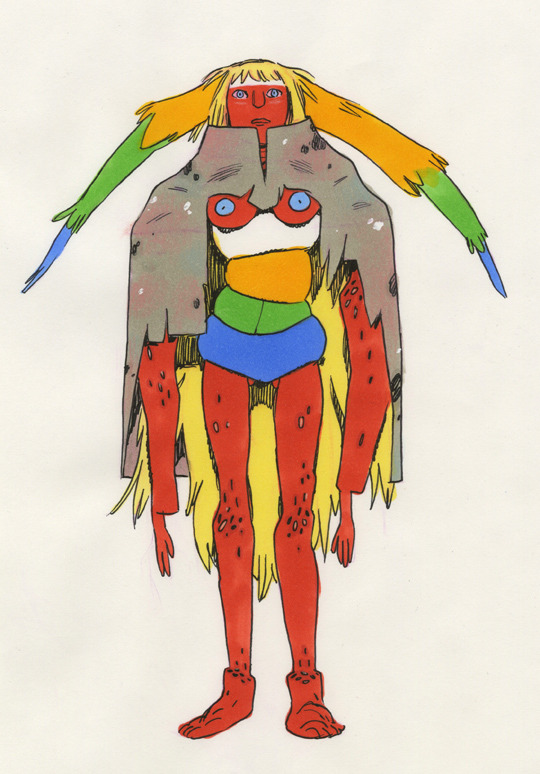
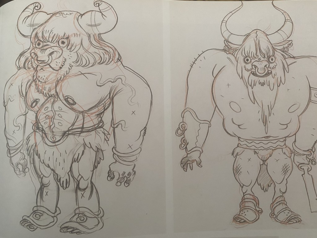
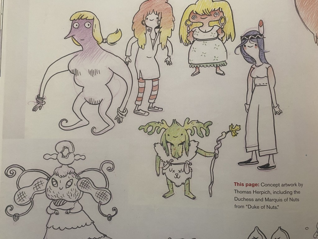
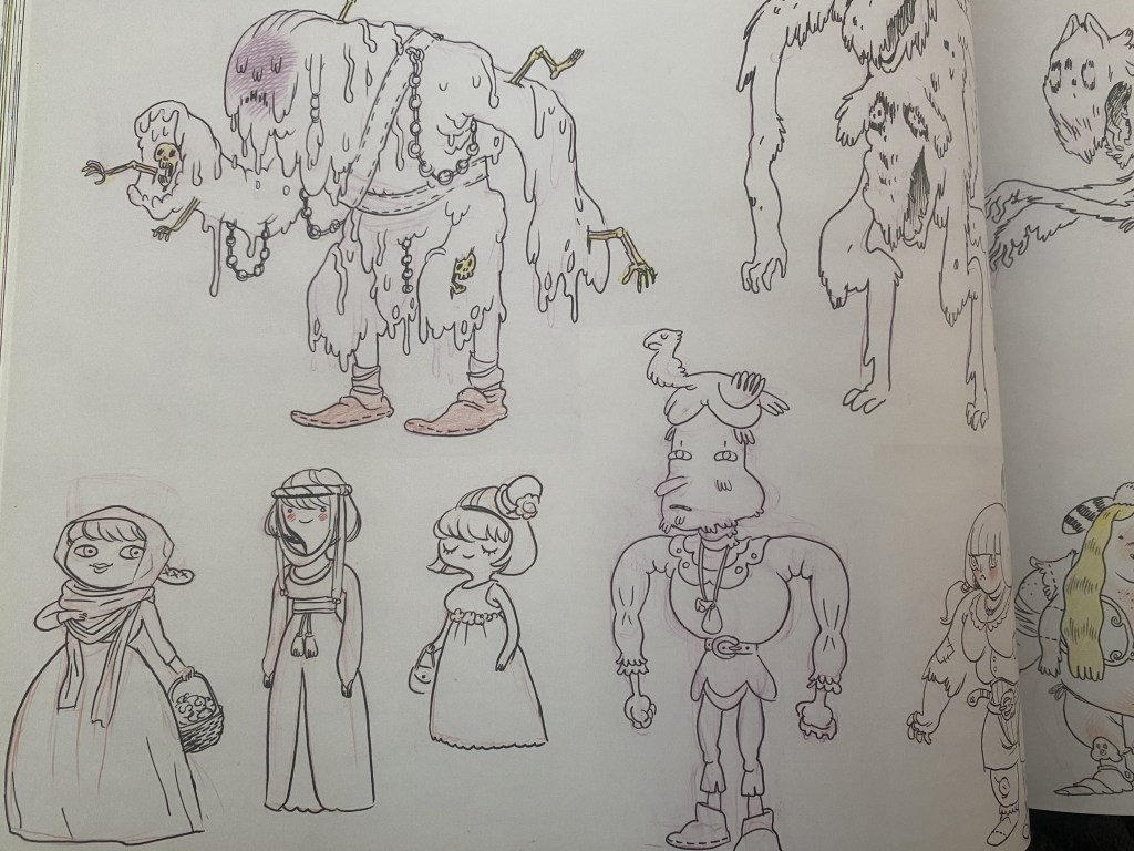
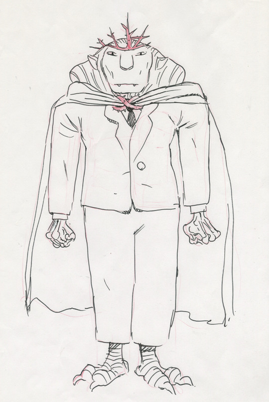
Concept Art

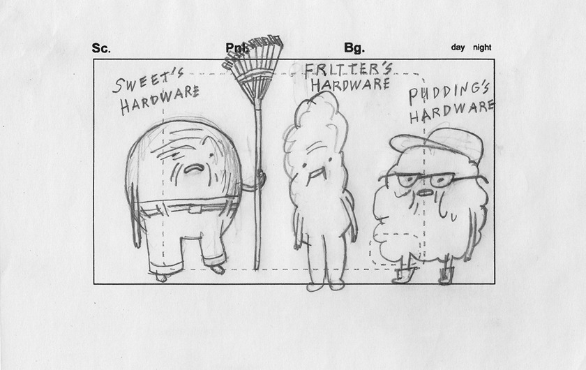
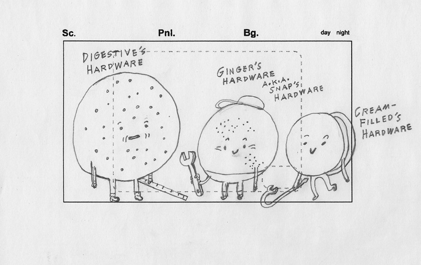
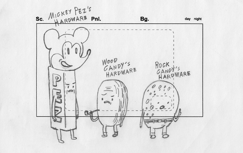
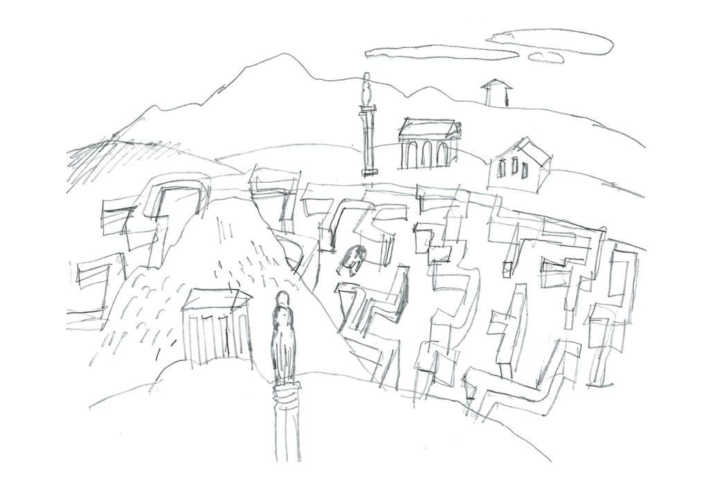
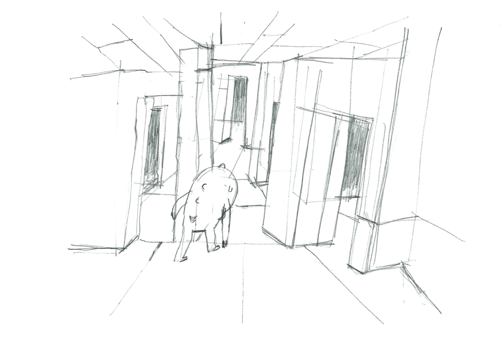
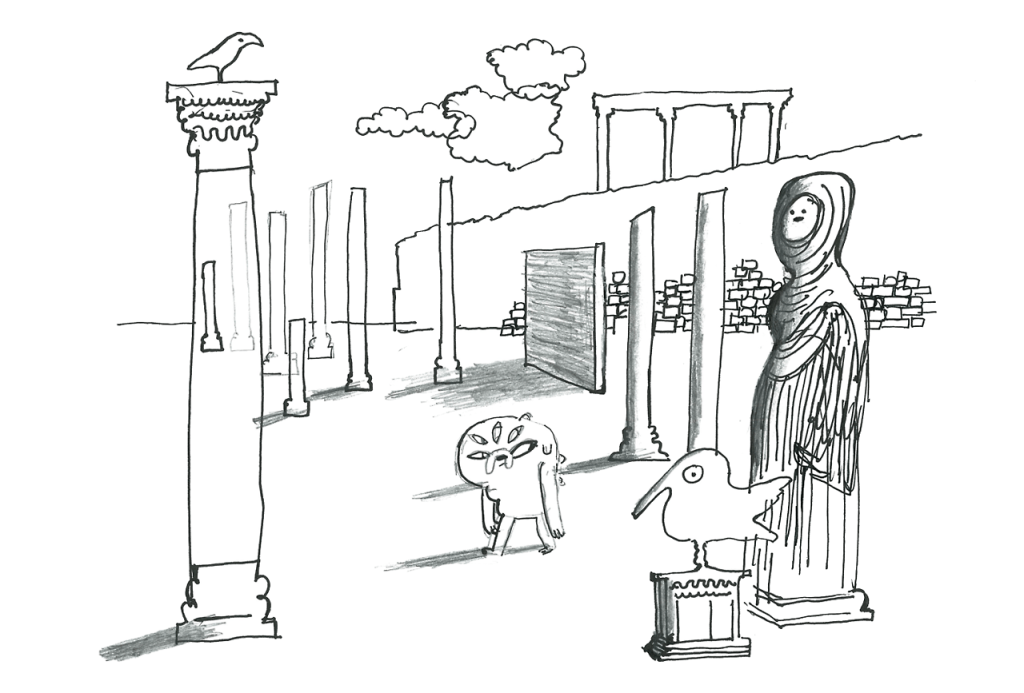
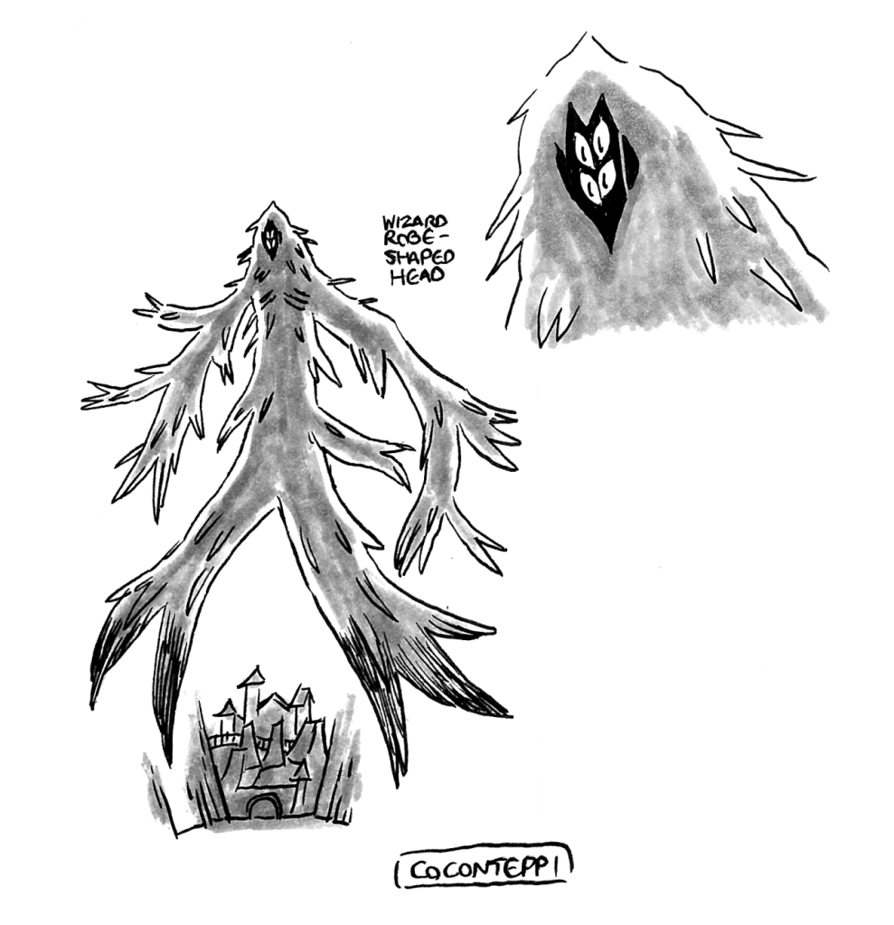
Miscellaneous concept work from Falk of designs he whipped up for the hardware store owner in Root Beer Guy and the visual scope of Abstract.
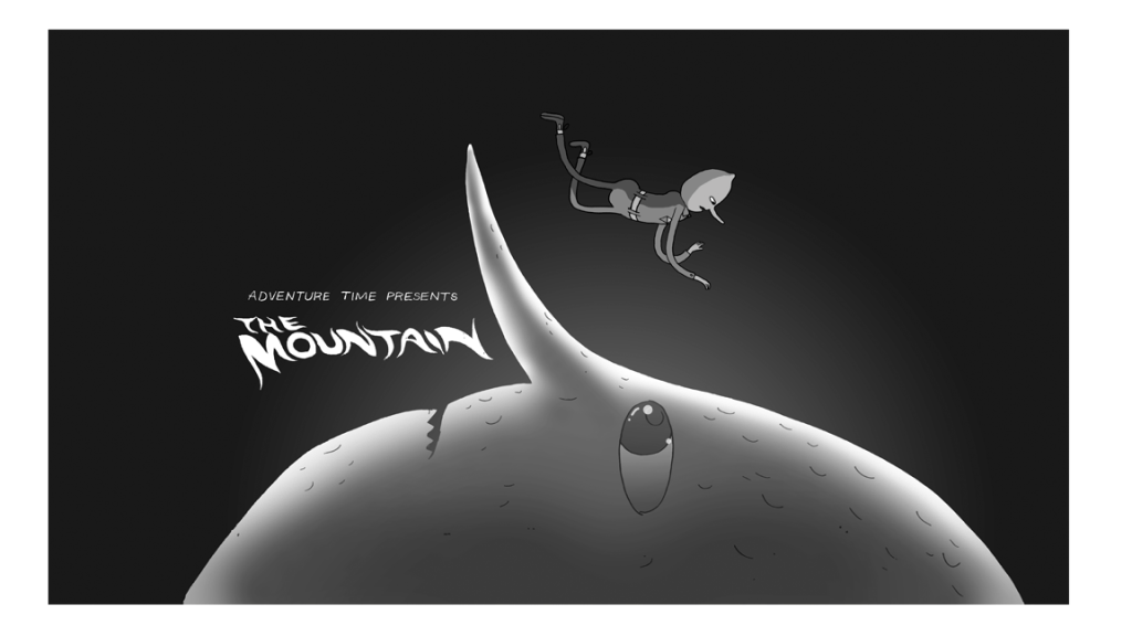
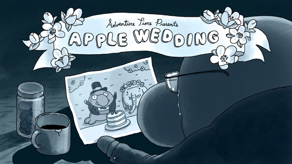
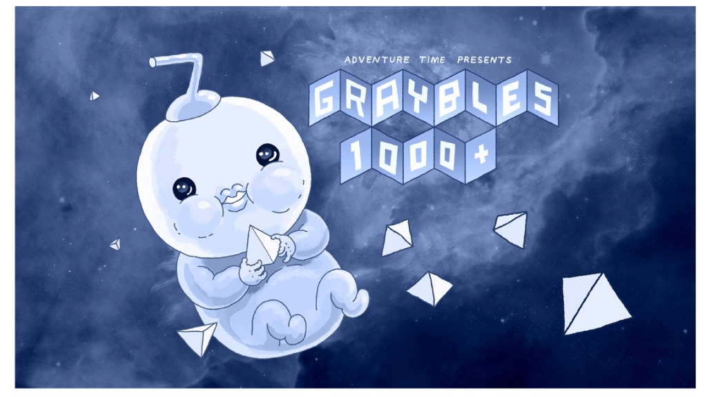
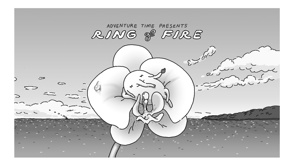
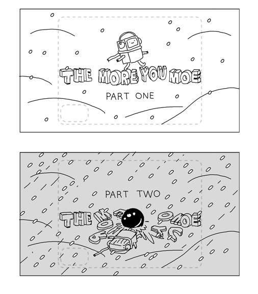
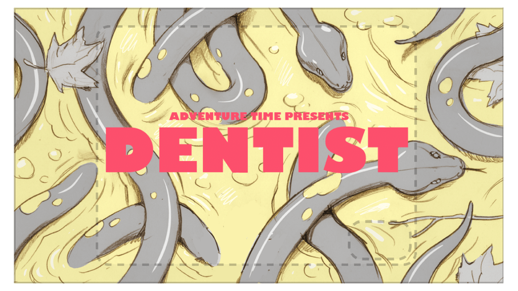
Title Cards

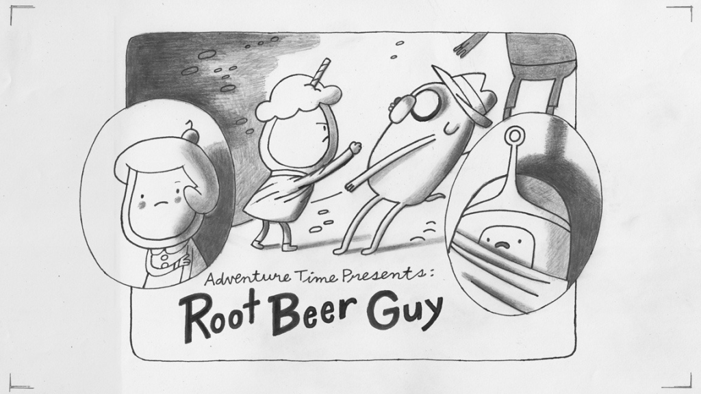
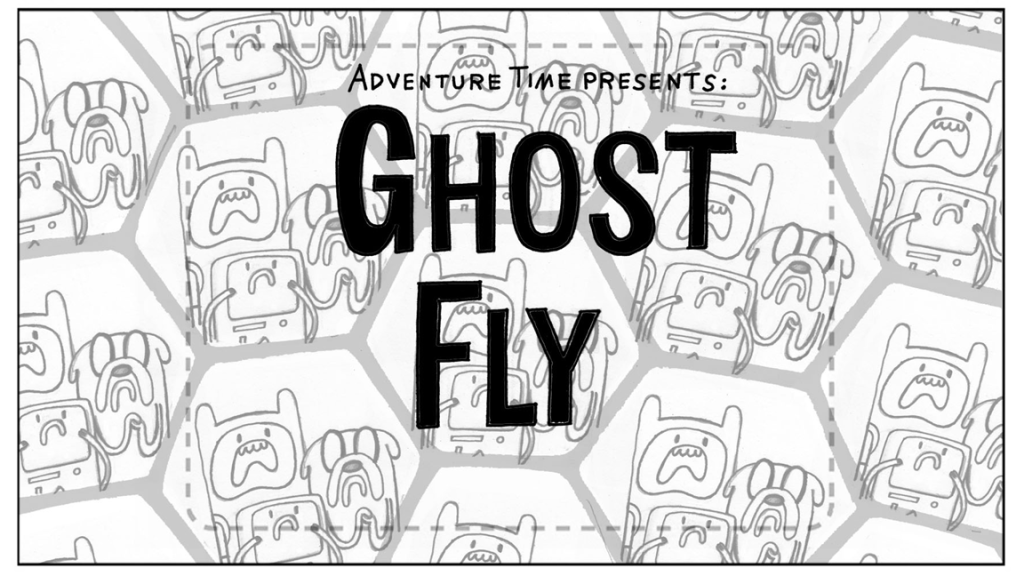
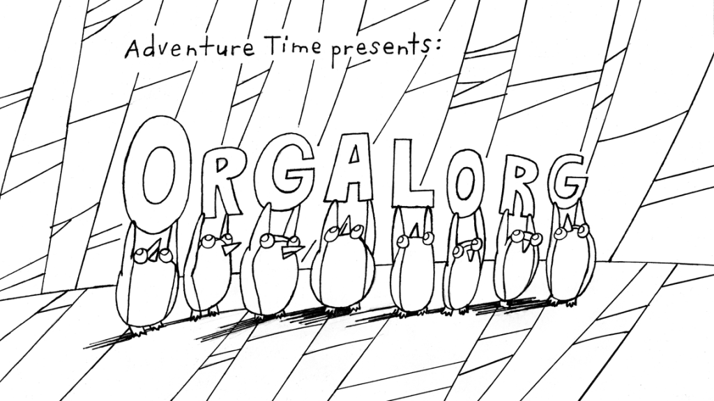
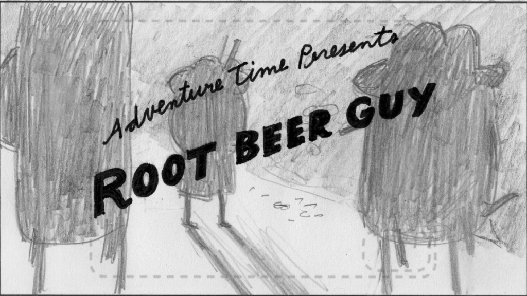
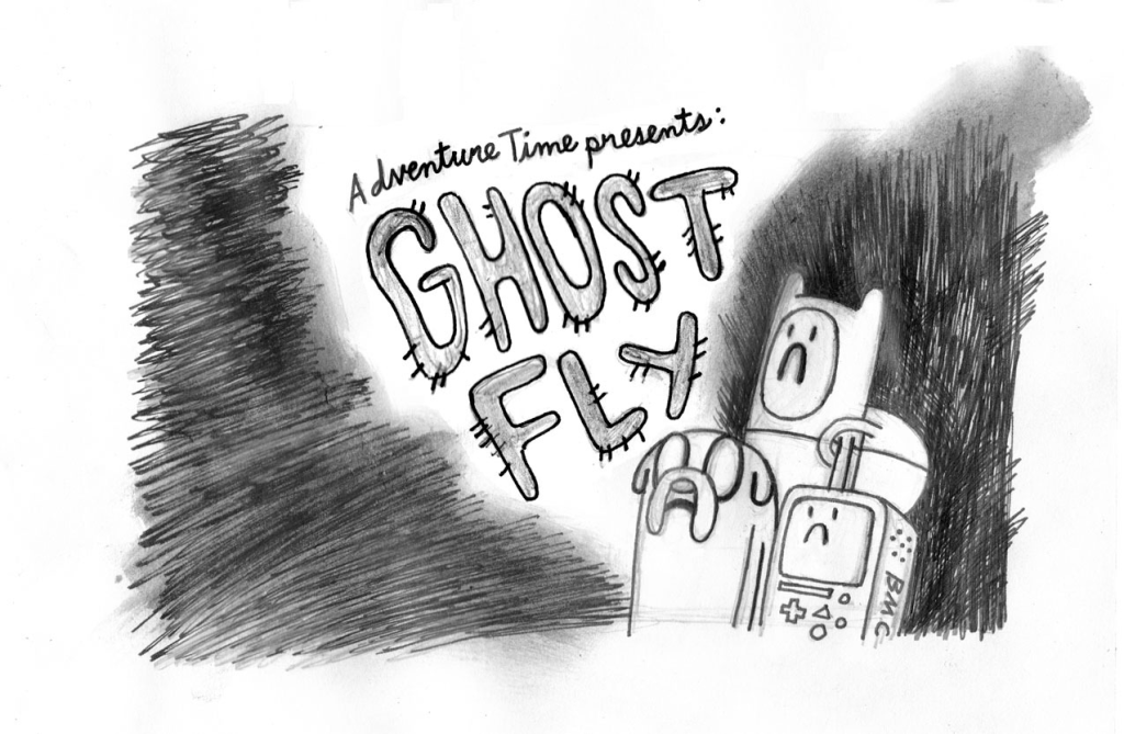
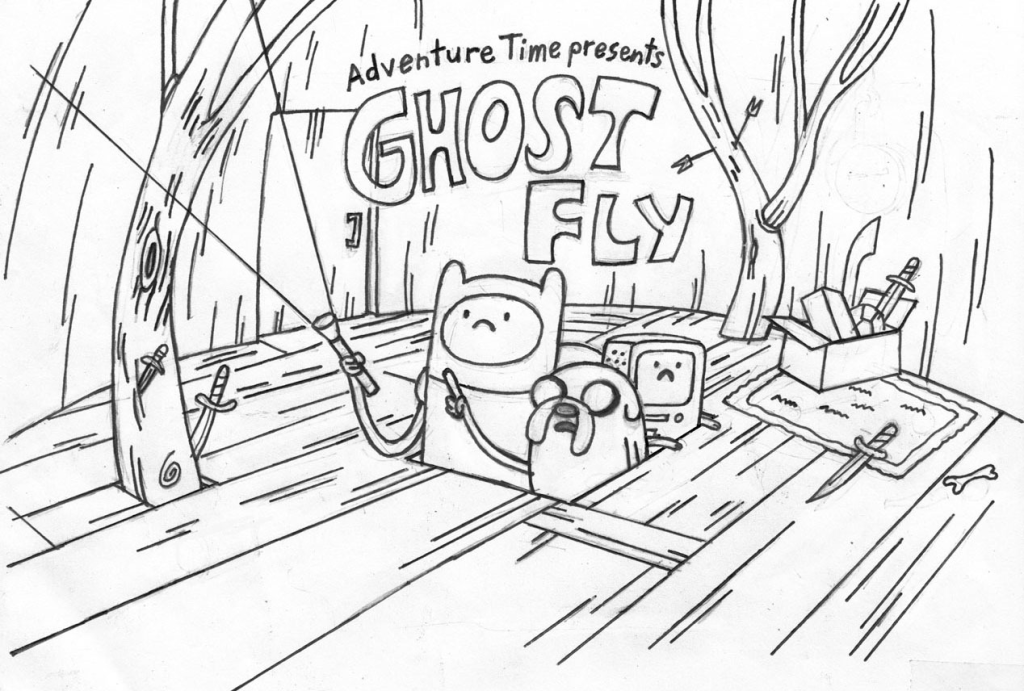
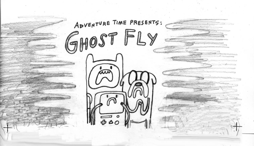
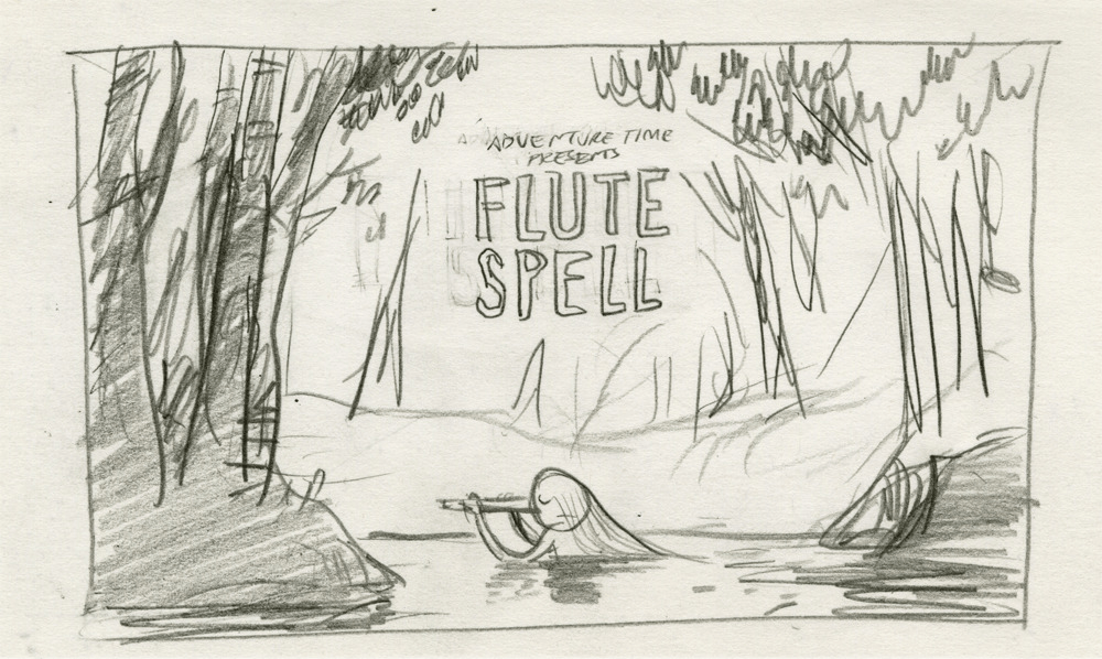
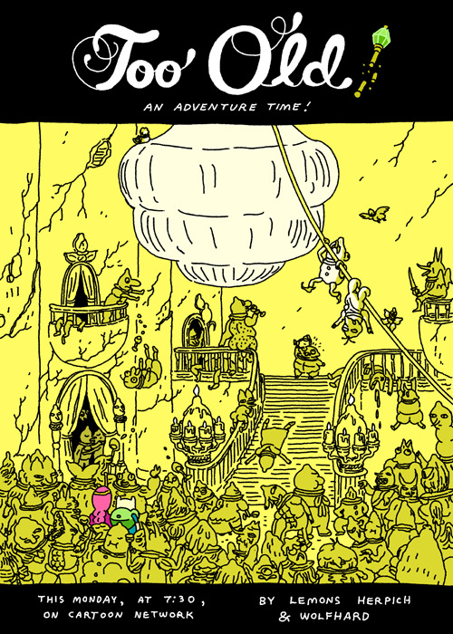
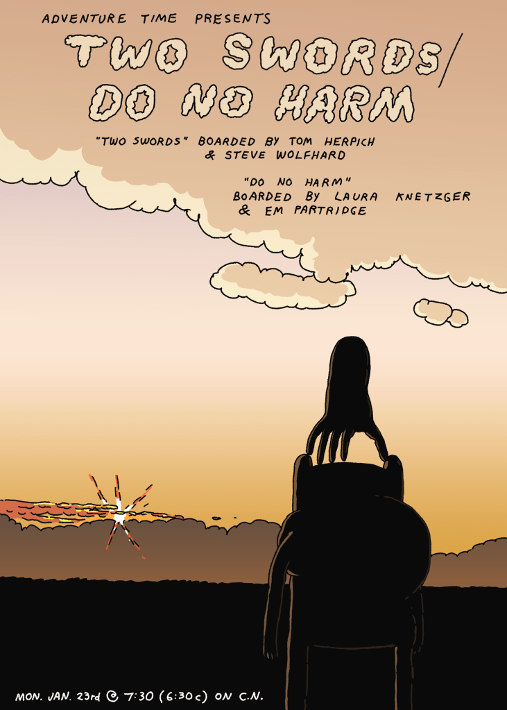
A few original title cards that Falk designed, along with a large chunk of concept sketches that didn’t make the cut.
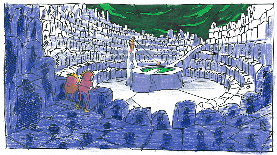
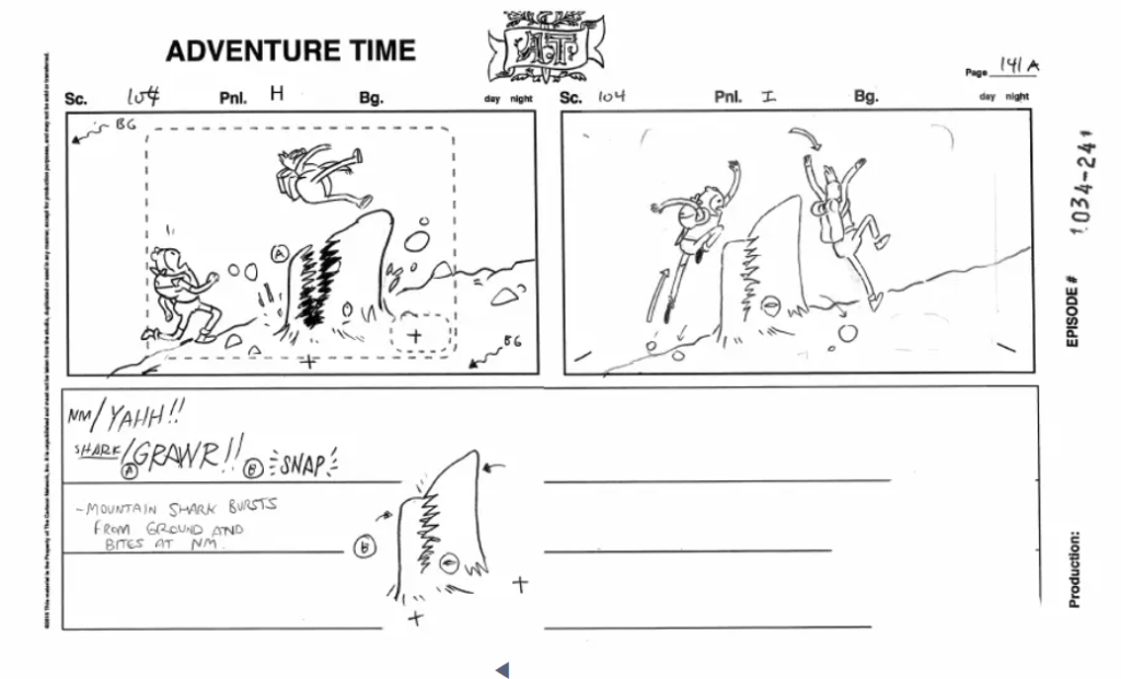
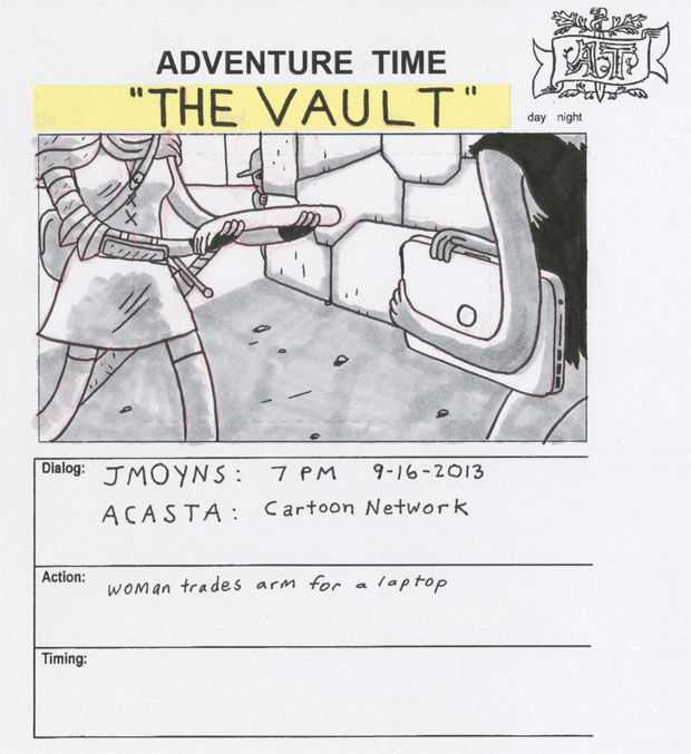
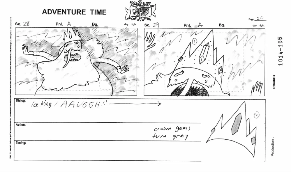
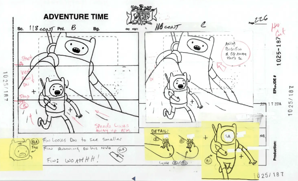
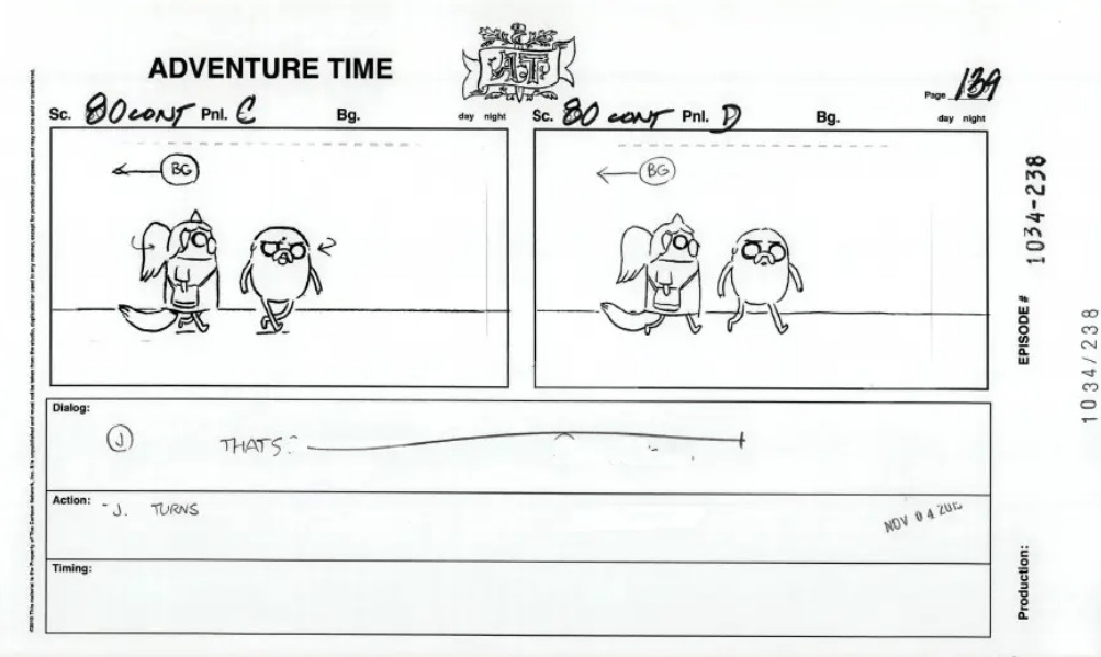
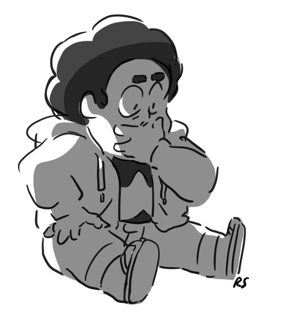
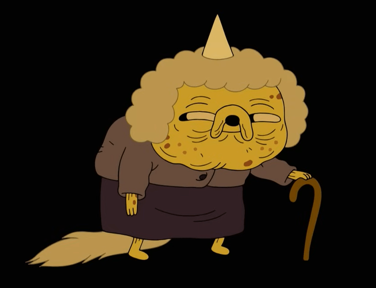
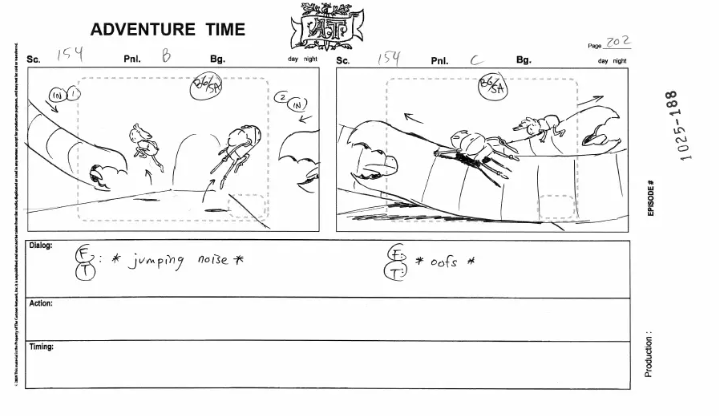
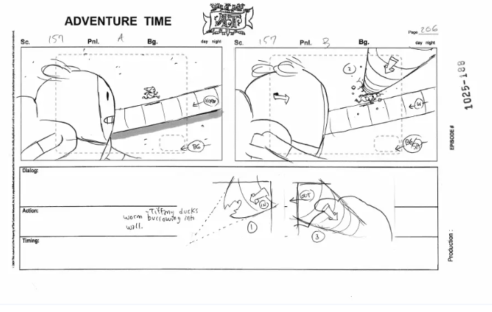
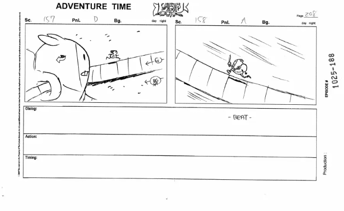
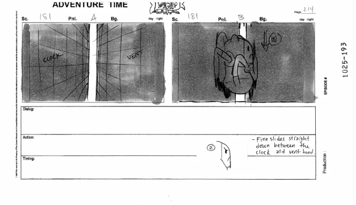
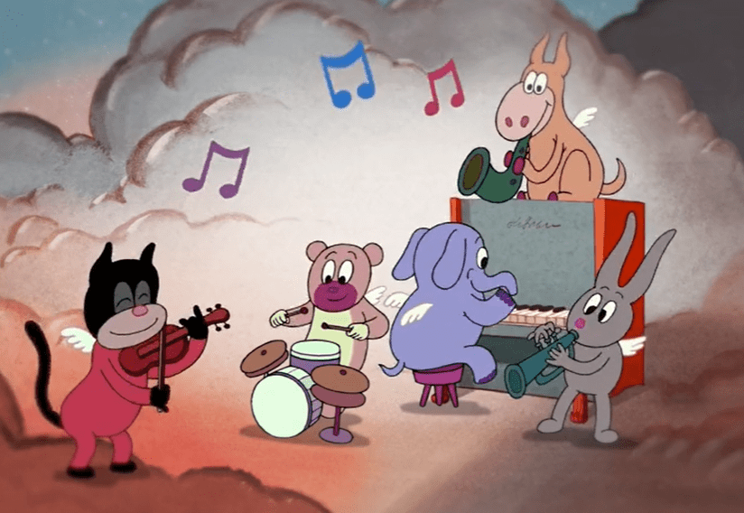
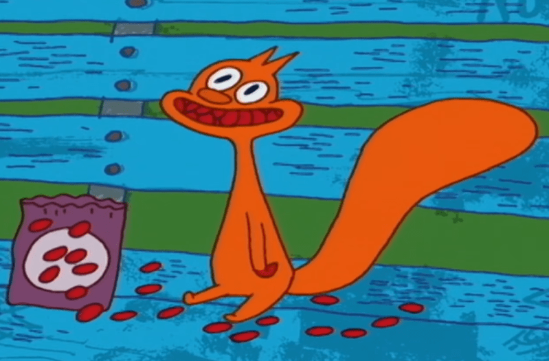
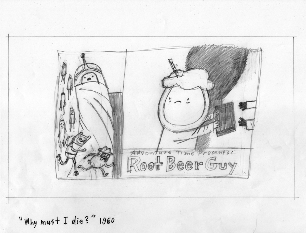
Storyboards

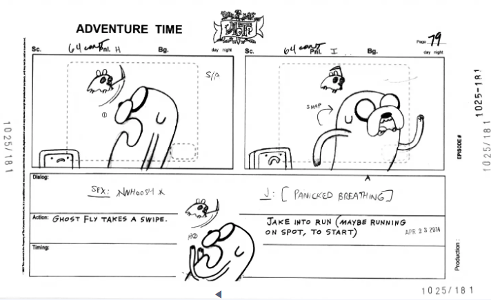
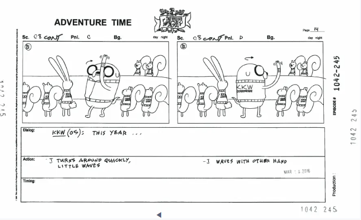
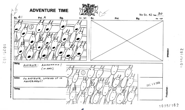
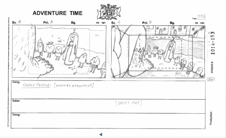
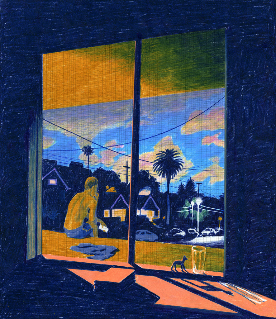
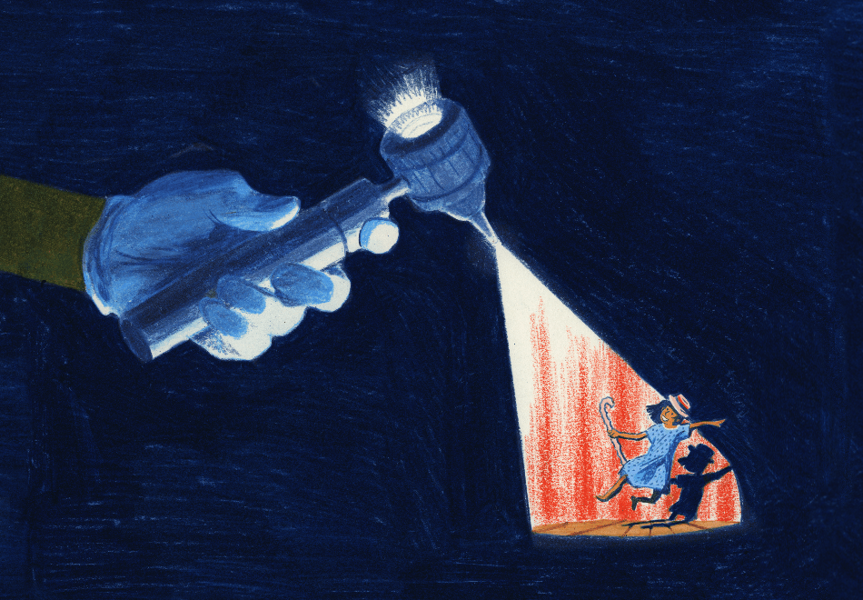
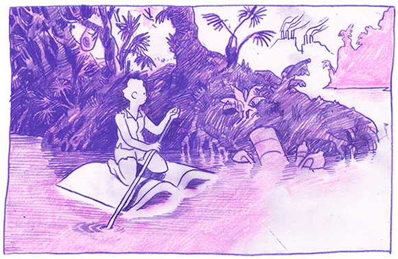
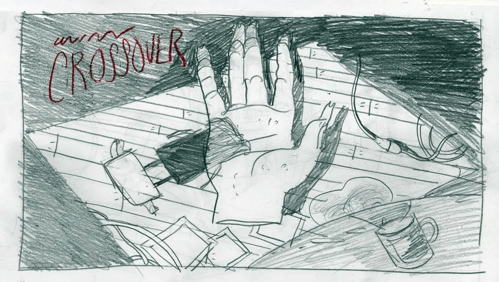
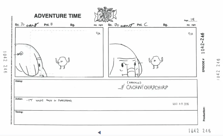
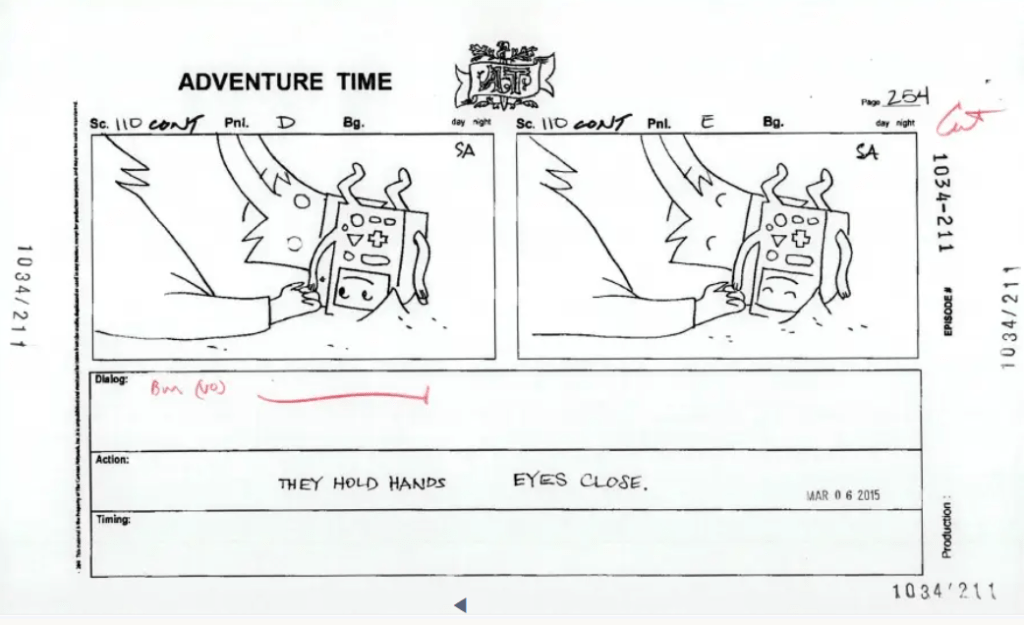
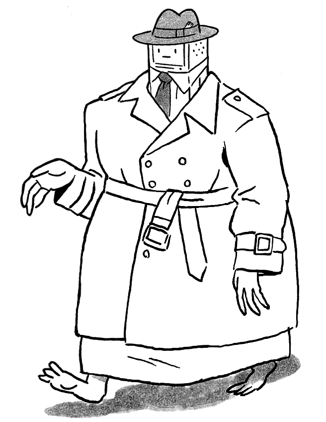
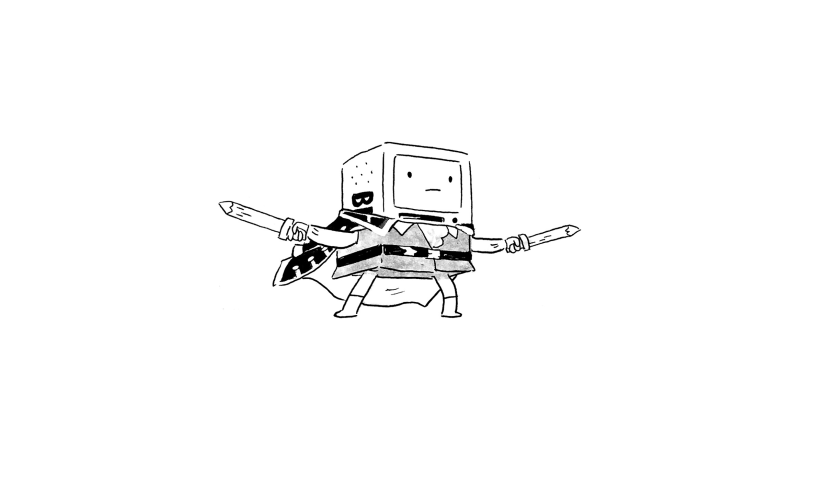
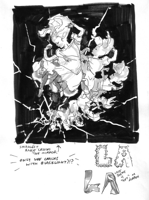
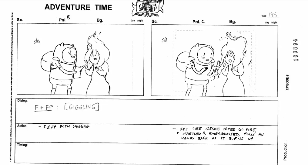
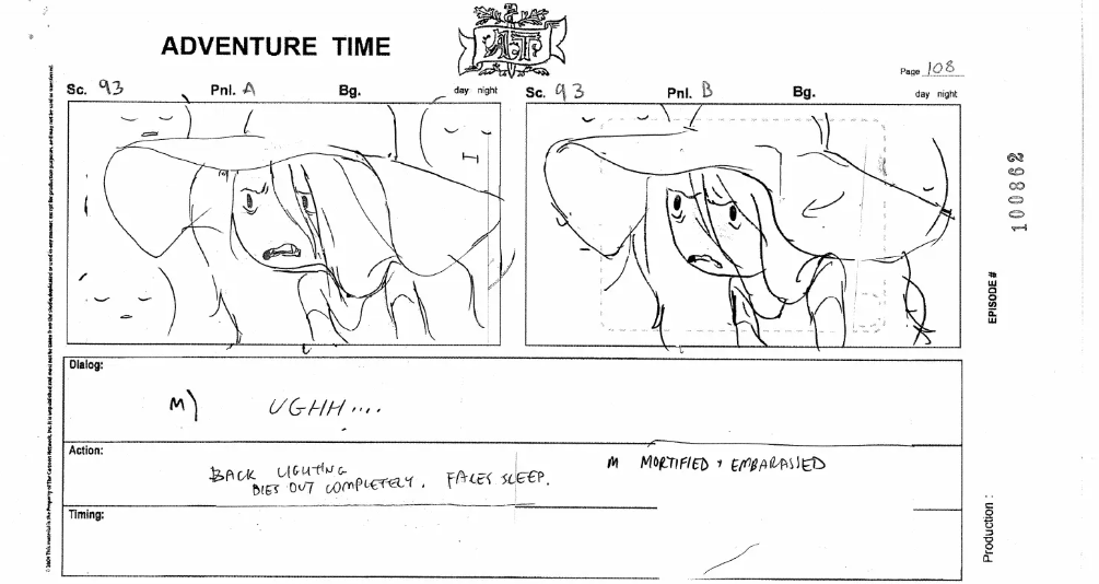
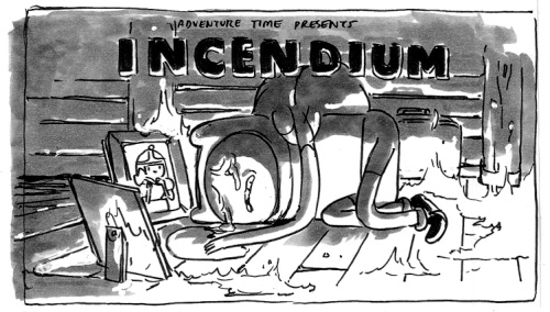
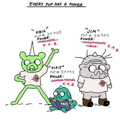
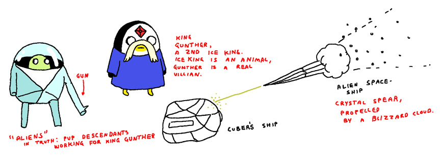
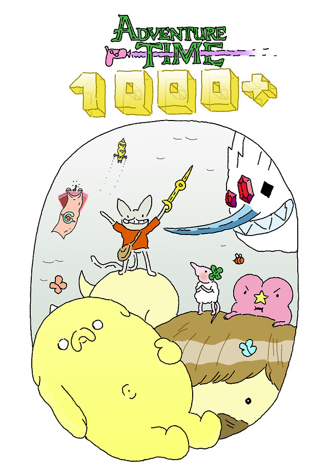
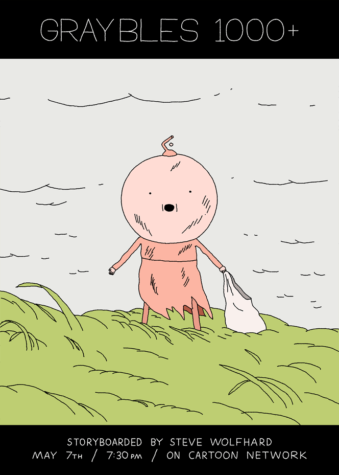
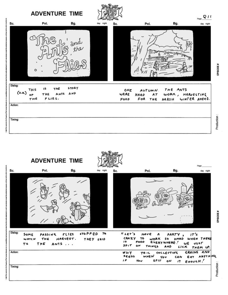
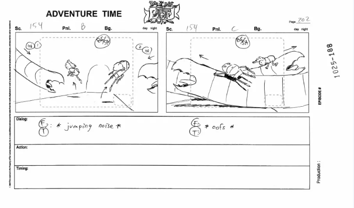
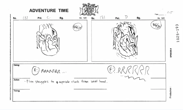
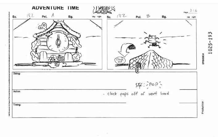
A collection of silly Falk boards.

Uncategorized

Artist Spotlight – Sam Alden

A late bloomer during the OG series, but one that became just as recognizable as the longtime alum, Sam Alden joined the series starting with The Mountain and later became a series regular beginning midway through season 7. Alden was often paired with Jesse Moynihan in his early days, before taking on a similar role as his counterpart, being paired with many different partners throughout the rest of the show’s run. Pretty much anywhere he landed, Alden delighted with standout boarding efforts and some of the better Finn-centric entries in AT‘s last run.

Art Style

With a main focus in pencil art, Alden’s portfolio consists mainly of his short-form comics and intimate, portrait-esque illustrations. It’s a natural fit that Alden was paired with Jesse, as Alden’s love for vivid colors is easily apparent in his work. Experimentation with color can be readily seen in the examples above, with harsh contrasting elements, two-tone schemes, and washed out, dreamy backdrops.

Finn & Friends

The biggest dead giveaway that Alden had his hands in an AT episode is the quotation eyes, which Finn is frequently seen sporting, as seen in images four, five, seven, and eight. I just said on my last post that Moynihan takes the cake for the biggest, roundest pupils on Finn, though I may have spoke too soon. Alden will often draw Finn with massive pupils, a face that takes up most of his head area, very large ear nubs on his hat, and some big, eye bag accents. Also, Alden’s Finn has a generally lengthier body than other iterations, sporting longer arms and legs. Honestly, it’s fitting that Alden wrote the Come Along With Me gag where PB acknowledges how tall he’s gotten.

Jake isn’t a character that Alden has had a ton of time with, as he’s predominantly absent from a good chunk of the artist’s portfolio: The Mountain, High Strangeness, Happy Warrior, Whispers, The Wild Hunt, and Blenanas. So, it’s a bit difficult to point out his Jake, but he still boasts some unique touches. Something consistent with other characters Alden draws (including Finn) is the focus on a character’s bottom teeth with no visible top teeth. There’s also some idiosyncrasies he shares with his board partner, Jesse Moynihan, such as the eye shape and the black sections peaking out on both sides of the white.

Some other characters/shots where Alden’s influence is apparent. Quotation eyes, absolutely massive pupils, and some bottom teeth love.

Promo Art

Alden has created some of the most beautiful promo art the series has seen. Probably the most consistent in format, as each promo feels like it is part of a whole series.

Concept Art

Alden has worked behind-the-scenes to develop a bunch of different elements that made their way into the series, such as the Mountain of Matthew, Bandit Princess, the electric boar, Ice Finn’s domain, and some early looks at Finn’s parents.

Title Cards

With the exception of the Islands and Elements miniseries, Alden has designed the title card for every episode he’s worked on (excluded are The Wild Hunt and Blenanas, which did not have rough versions available).

Some title card roughs from Alden.

Storyboards

Select Alden boards. The unavoidable quotation eyes and a glance at Normal Man‘s fast-paced mountain sequence.

Uncategorized

Artist Spotlight – Jesse Moynihan

It’s Jmoyns time! I’ve gushed about Jesse plenty on this blog; aside from Tom Herpich, he’s probably my favorite board artist in the series. So much of his own personal tastes and style bleed into those boards in a way that’s really inspiring to me. He’s come a long way throughout the series, starting out with some really wonky drawings that didn’t translate super well into the final animation to becoming one of the most rounded and consistent artists, both art and tone wise.

Art Style

Moynihan’s artwork, done primarily with all physical materials combines psychedelic colors, geometric shapes, and fantastical characters wearing wrestling gear. He started off focusing on making comics, which mainly consisted of his series Forming, before getting recruited by Pen Ward to work on AT. Jesse typically tackles both the spiritual and psychological through his own work, which transferred over into most of his AT outings from season four onward. More than any other storyboard artist in the series, Jesse has poured a large chunk of his life into his writing. Each artist has their own personal voice and quirks, but I don’t think anyone quite reached the same level of vulnerability that Jesse did. The show almost became a diary for him at certain points, as he dealt with his own questions about finding inner peace in The Mountain or had a raw unraveling when struggling to cope after a tumultuous break up with his former girlfriend, whom he also called “Margles.” A lot of his stuff has been pointed to as an example of the show’s growing pretentiousness, though I think his relationship with the series is probably the best example of its strengths. Using the show, its characters, its world and its rules to create something personal and unique with each individual outing.

Manly

Manly, a short made by Jesse and his brother for Cartoon Hangover, additionally exhibits the hallmarks mentioned above. It’s also a good chance to see more consistencies in his drawings that cross over into AT, namely the eye shapes, forced perspective, and a contrasting blend between simple designs and complex anatomy. Unrelated to Manly, but Justin Moynihan, Jesse’s brother, has contributed a bit to the main series musically, including Lost in the Darkness, Love in the Darkness, and the Booboo Sousa song. Jesse has also contributed to the show song-wise, including Real Power, Yeah Girl, It Stinks, and Braco Don’t Go.

Midnight Gospel

Moynihan served as art director for Pendleton Ward’s other series, The Midnight Gospel. A lot can be taken away from the background art in terms of how it matches the sensibilities detailed above. It’s a perfect mix between Ward’s simple charm and the psychedelia of Duncan Trussell.

Finn & Friends

Moynihan Finn’s have some BIG round pupils. Maybe some of the biggest Finn pupes in the series (Not counting Lucyola Langi, because she obviously takes the cake). When they’re not massive and circular, a classic Moynihanism is the slanted, oval eyes that appear on a lot of different characters, notable in images one, four, and five. Moynihan Finns also most commonly emote with raised eyebrows, seen in images six, seven, and eight. His Finn usually has more teeth displayed than the average Finn, as seen in images five and eight. While eye highlights are something common throughout the series and with every artist, Moynihan’s eye highlights are usually much smaller and more muted, as seen in the first and last image. And perhaps one of the biggest dead giveaways for a Moynihan Finn is the more defined shoulders, noted in images two, three, and seven. In fact, Moynihan is perhaps the artist that most frequently draws Finn without his backpack. Examples include Hitman, Who Would Win, Breezy, Is That You?, Astral Plane, and Checkmate.

Moynihan Jakes usually possess the same simplistic, raised eyebrows that his Finn’s have, as seen in images one, three, five, and eight. Perhaps most distinctive are eyes Moynihan draws for Jake, which will slant in the same sideways motion as Finn’s, with the whites receding into the black, as noted in images five, seven, and nine. In fact, the black in Jake’s eyes often swallows up the white pupils, making them much smaller than most board artists – seen in most images but primarily in one, four, six, and eight. Jake’s eye sockets will additionally often bulge off the side of his head, noted in the first two images. And, in typical Moynihan fashion, Jake’s shoulders are much more prominent. Seen in images one, three and four. A Moynihan Jake ear will often curl off the side of his head, but often not as dramatically as a Muto or Nyström ear.

Some other Moynihan character shots. Lots of slanted eyes, forced perspective, big pupils, extra teeth , defined shoulders, and the occasional sassy arms-on-hips.

Promo Art

Moynihan has created A LOT of promo art throughout the series, mostly in a black-and-white fashion with heavy shading, while some let his love for bright, vivid colors shine. Others are simplistic notebook doodles, which I always appreciate as well. Board artists don’t need to create promo art for episodes, so I always like when they commit to putting something out, even if that is just a simple doodle on paper. Some are really elaborate, like his last two season six episodes that incorporate live action elements. It’s pretty cool to additionally see the shear volume of people Moynihan has worked with throughout his tenure. He most consistently worked with Ako Castuera, but has partnered with various other artists, most notably throughout seasons 5 and 6. He might be the artist with the highest volume of partners? I could probably fact check that, but I’m not gunna.

Storyboards

Some select Moynihan boards. In a similar look to his promo art, Moynihan will often incorporate his own sense of shading into his boards, even if said shading doesn’t make it into the final product (i.e. Betty). Also included is his love for forced perspective, and a cameo from the lost beta character Tiny Hippogriff.

Adventure Time, Animation

Artist Spotlight – Adam Muto

Muto’s been with the show since the beginning, and has become the head honcho following the departure of Pen Ward. I always have said that it’s kind of hard to understand Muto’s vision for the overall series when it comes to tone and direction. I think more than anything his love for the series additionally includes letting the artists do what they do best while also trying to evolve and expand the world and keeping the characters relatively evergreen. When it comes to boarding, it can be equally difficult to determine which sections Muto worked on unless it’s with someone very distinctive, such as Sugar. His style is so synonymous with the polished look of the series that there’s definitively overlapping synchronicities in style. Not to say that he doesn’t have his own flair, however. Muto’s probably of the best draftsmen in the entire series, churning out some really clean and neat drawings that bleed through even in his rough storyboards.

Art Style

Muto is a comic man most prominently. Most of his style can be analyzed through his two most prominent comic series – Tall Penguin and Future Boyfriend. I’m always impressed by how clean Muto’s linework is, ranging from very simple shapes to more complex designs that never seem to battle each other. Diverging from the hyperrealism of his counterpart, Rebecca Sugar, Muto lends himself to more cartoonish sensibilities. It’s easy to see how Adventure Time has impacted his own look, while also noting the nuances that bleed through in his own boards. Very wide faces, forced perspective, small slants for eyebags, the heightened detail mixed with extreme simplicities. Muto mainly avoids color in his artwork and sticks with a monotone drop.

Finn & Friends

woof. This one was a toughie. Scanning through the earlier seasons, it’s really difficult to denote Muto hallmarks outside of the observation that “this bit was not boarded by Rebecca Sugar.” I don’t mean that to make it seem like Muto is an inferior artist, most of his drawings look great! It’s just somewhat difficult to distinguish his Finn apart from some of the many other iterations in the series. Something pretty consistent with all of Muto’s art is his wide-eyed characters donning slanty eye bags, which Finn takes on in the first and fifth image. One feature I never really noticed until I was researching for this write-up was the slightly curled dot eyes that will show up more so in the earlier Muto efforts, seen in the second and third images. Also, the thin, liney eyebrows in images four and six carry through most of Muto’s episodes throughout the series.

Muto’s Jake is way more easily recognizable than his Finn. Muto and Wolfhard have an unspoken competition for crankiest, wrinkliest Jake. While Wolfhard’s accents are noted by their smallness, Muto goes for a bigger, more expanded approach with Jake’s features, often making his eyes, nose, and mouth take over most of his body. These choices really get to shine in Daddy-Daughter Card Wars more than anywhere else. As seen in image 3, 7, and 9, Muto will often have Jake’s ears hang off his body as little nubs. Though, I usually associate this design choice more with Hanna K. Nyström.

This gallery of other characters is mostly just me realizing that Muto’s style is perhaps most notable on the dog characters, and his love for drawing them in side view. Again, a bit difficult to find some specific examples where an image really stands out as “yeah, that’s a Muto drawing.”

Concept Art

Muto regularly dips his toes into conceptualizing ideas for the series. A lot of these have made their way into the show verbatim (Finn and Jake Banana Guard disguises, Nightmare Princess, BMO and Ice King’s business outfit) while others were expanded upon by other board artists (Fern’s design).

Misc.

Muto has whipped up a lot of gift drawings and non-episode promo images, mainly towards the original show’s climax. Like most of his art, they’re done in his traditional black-and-white style.

Storyboards

Some Muto boards, showcasing both his love for added details, thick and defined outlines, and sideview pups.

Uncategorized

Artist Spotlight – Rebecca Sugar

Perhaps the most prolific of AT‘s production crew, Rebecca Sugar is one of the few board artists that nearly every AT fan, casual or seasoned, has been able to recognize. Known for her more overtly emotional style of writing and very blobby, expressive sketches, Sugar may have the most distinctive visual identity in the entire series. If a character is seen crying between seasons two and four, there’s a good chance Sugar was at the helm.

Art Style

If Herpich’s style incorporates a blend of realistic human anatomy and cartoony features, Sugar’s is that to the nth degree. Her love for human anatomy bleeds through in her dancing sketches, as seen in images 3 and 4, which boast extremely dynamic posing that are rich for exaggeration in other examples. For an artist that delves so deep into emotional and physical realism, it’s astounding how much she is willing to push to an almost extreme level when it comes to facial expressions and body language. None of this is more evident than in her short film Singles, which features an entirely convincing display of human body language in the blobbiest, most absurd way. These are the sensibilities that bleed most into her AT work – extreme dynamic posing with characters that essentially bleed out of their own anatomy with emotion.

Concept Art

Various different sketches from Sugar, some of which develop design aspects for episodes (Flame Princess’s general look, Marceline’s outfits) while others are seemingly just drawings whipped up in her spare time. All of her general interests bleed through in these sketches – Flame Princess, Fionna & Cake, fashion and hair, and of course, Marceline.

Steven Universe

It wouldn’t make sense to do this without some Steven! The Sugar trademarks bleed through the most in these sketches – strong posing, stretched faces, expressive eyes, lowered mouth, anime accents, bulbous features, and a love for dancing and outfit changes. It’s no wonder that Sugar crafted Marceline’s most iconic outfit in What Was Missing.

Finn & Friends

Talk about bulbous! Sugar’s Finn is the blobbiest Finn of all. Perhaps most distinctive are his facial features, which will range from the eyes becoming huge and glossy while the mouth shrinks, to the mouth becoming massive and complementing with equally large eyes. The mouth is quite possibly even more distinctive than those huge anime eyes, often morphing into a Muppet mouth that flaps off the side, mostly notably in the seventh image. Eyebags and wrinkles are common, though they usually drastically range in size and detail (different from the previously explored Steve Wolfhard who has a pretty consistent line weight and size for all of his accents). Of course, blushing and anime eyes are also staples, and that excellent sense of posing bleeds through in the eighth image. Perhaps most unique is how much Finn’s hat actually feels like a separate piece of apparel rather than a legitimate staple of his body in Sugar’s drawings. His face will often protrude outside of the hat, as seen in the fifth and ninth image.

Jake isn’t usually a focal point in Sugar entries (even her sections during Jake vs Me-Mow were mostly centered around the Finn portions) but her touch is still evident when working with him. It’s a chance for her more simplistic attributes to shine, like the boomerang mouth seen throughout these images, which is usually more pushed than the typical bean mouth. He’s also a bit more segmented than the usual Jake, often having a clear separation between his back and lower half, as seen in the first and last images. Again, emphasizing that great sense of posing.

Some more Sugar shots of other characters. Mouths off to the side, boomerangs, tears, eye bags, and some of the most realistic hair physics you’ll ever see in the series. There’s plenty of implications of her styles in Seasons 2 and 3, but her contributions are really unmistakable from Season 4 onward. I think Jake the Dog is probably where her style shines the most, because she gets to work with eye whites and noses. That first shot is essentially just a Steven Universe character.

Promo Art

I believe Rebecca was the first board artist from the series to start doing individual episode promos. These promos range from detailed black-and-white drawings to full, vibrantly colored pieces, often without any type of backdrop. Sugar is also unique in having miniature versions of her and Adam Muto (and later Cole Sanchez, to a lesser extent) in all of her promos from Season 2-3. Tom Herpich would later mimic this for a bit during his time working with Ako Castuera throughout Season 2.

Storyboards

A handful of Sugar boards in all of their bulbous, emotional, sketchy glory.

Title Cards

As far as I’m aware, Sugar has only designed the title cards for two episodes: Incendium and I Remember You. I could only find a good scan of the Incendium rough design online, while the I Remember You initial sketch can be found in Volume 2 of the title cards book from a few years ago. If anyone has a clean copy, feel free to send my way and I’ll add it above!

Uncategorized

Artist Spotlight – Steve Wolfhard

Known for his love of tabletop games and general affinity for the pups, King of Ooo, and the 1000+ Ooo-scape, Steve Wolfhard started out as a board revisionist before becoming a full-time board artist at the start of season 5. His partnership with Tom Herpich has been the longest running board team for the entirety of the series, and despite their general overlapping interests (Tree Trunks, Finn and Jake’s brotherhood, Finn being kind of stupid) Wolfhard’s style largely contrasts Herpich when it comes to design.

Art Style

Wolfhard’s style is easily recognizable for its super thin, squiggly outlines. Details mostly extend to facial accents, such as wrinkles, eyebags, hairs, and fuller lips. His sensibilities are similar to that of his partner, connecting to the magic and sorcery of the world while also leaning more toward a cartoonier side. Wolfhard has worked on a few animated shows post AT, most notably Amphibia.

Concept Art

Wolfhard’s squiggly outlines and flat color are prominent in most of his artwork – concepts included. Wolfhard has maybe created the most concept artwork for the series, with a blend of ideas he conjured up for the episodes he’s worked on (Finn and Jake’s KOO armor, the adult pups) while others involve oddball pitches that don’t get off the floor (Finn dating the Mona Lisa, King of Ooo dating an androgynous blue figure). Some of these oddball ideas do end up making their way into the series later in the process (Slime Princess growing huge, King of Ooo being a little waxman).

Pups

Wolfhard has an affinity for the pups, which makes sense – it was one of the first elements of the series that he had a part in developing. Lots of different points of development above, including appearance and personality outlines for the pups.

1000+

This section isn’t entirely unique from the one before it, as the pups make their way into the 1000+ lore. Wolfhard got to build the visual look for the 1000+ world pretty much from scratch, and most of his character concepts made it into the actual show, with the exception of Wintergreen and Clover, the possum standing on Sweet P’s head.

Finn & Friends

Whenever Finn or any other character is drawn with thin face wrinkles or more prominent lips and cheeks, that can be a dead giveaway of Wolfhard’s touch. When Finn isn’t wrinkly, it can be a little bit more difficult to tell of Wolfhard’s touch. Standard shots of Finn are very simplistic looking, as seen in the final image. Sometimes he’ll give Finn or other characters a dumb little cheeky smile as seen in the fourth image, though this is an expression that most of the staff likes to churn out from time to time. Wolfhard’s details can usually be noted by their “small”ness, not overly exaggerated and usually manifest as minute line strokes.

Wolfhard’s Jake is a bit more identifiable than his Finn, because boy, is this guy cranky!! Again, the simplicity is key here. Anytime you see those thin, slanted, slightly wobbly eyebrows on Jake, it’s likely going to be Wolfhard. His most focal ear is usually just hanging off the side a bit, while the second may peak off or be hidden.

Some Wolfhard board-to-animation drawings in all of their wrinkly, big-lipped glory. Also some dumb smiles.

Promo Art

Often, instead of doing promo artwork, Wolfhard will conjure up full comic strips for the featured episode. I linked Daddy-Daughter Card Wars and The More You Moe, the Moe You Know to their full page.

Similar to Herpich, Wolfhard has made some really powerful Finn solo stuff that I think is gnarly.

Storyboards

Some cut scenes from episodes that Wolfhard has boarded – those squiggly lines are, of course, most prominent in the boards.

Title Cards

Some title cards Wolfhard has designed. It’s interesting because these are generally larger than his usual visual efforts, often featuring grand features and extremely detailed backgrounds. Wolfhard’s handwritten titles can be most prominently noted on episodes like Bonnie & Neddy and Ring of Fire, where they’re traced over precisely in the final product. Temple of Mars strayed away from this in the final product.

Some cut title cards that Wolfhard has crafted (he did end up creating the official title card for The More You Moe, the Moe You Know regardless).

Uncategorized

Artist Spotlight – Tom Herpich

What up, kiddos! Got a really cool notification the other day – AT Reviewed has surpassed 500K overall views! That’s really astounding to me – this started as a small project that I wasn’t even sure I’d get that far on, and snowballed into something that people seem to dig. So a few new updates – for one, it’s about time I got rid of those pesky, tiresome dermatologist ads that pop up after every paragraph, so no more intrusions in your reading experience! I also bought the domain, which should hopefully make it a lot easier to access the site.

Since there’s probably some lag time between seasons, I wanted to start a new little project. The new season brought a lot of new faces to the table, and while these fresh new voices helped to breathe new life into the AT world, it did make me miss the original team and how much I had become invested in their unique styles. That’s not to say that the new team doesn’t have their own voice, but it became much easier to detect the style of AT‘s alumni primarily because they had so many opportunities to showcase it in the course of nearly 300 episodes. And personally, part of the reason I wanted to start this blog was to highlight those individuals touches.

It remains very, very cool to me how Adventure Time brought together indie artists that mostly didn’t have a ton of professional experience or a style that seemed to mesh with the current landscape of children’s entertainment and unified those sensibilities to make way for something completely unique. So I wanted to pay tribute to that crew by doing this little Artist Spotlight series. As always, I have no idea how many of these I’ll realistically tackle over a period of time, and if there’s new AT content, those reviews will take priority. And as much as I’m inclined to talk, I’ll try to keep commentary relatively light. I want this to be more about celebrating the work of each artist (in a, by no means, comprehensive way) rather than to analyze writing or art style. But there’ll be a little bit of that too. First up is my personal favorite board artist, Tom Herpich!

Art Style


Herpich is one of the more detail-oriented artists working on the series. He often draws humanoids and beasts with various complex pieces of armor, clothing, accessories, etc. He also has a really solid combination of contrasting styles: body proportions are very detailed and close to human anatomy, while other features, like the eyes, nose, mouth are exaggerated and cartoonish. His style of writing is very much in the same vein – overly goofy humor wise but with a realistic sense of darkness in dramatic moments. Like most of the other artists, it becomes very apparent in seeing his own sensibilities bleed through from both a visual and tonal perspective.

Character Design

That love for detail really comes out in his character design work. Herpich started out as a character designer and would originally make designs overly complex in a way that didn’t really translate to the mostly simplistic style of the series. In an interview from the Art of Ooo book, in reference to Mannish Man’s initial designs, Herpich states, “I didn’t realize at the time that all this stuff was impossibly complicated, plus strayed so far from the original storyboard drawings that it would’ve all had to be reboarded to use these designs.” It’s interesting to see how the series shaped Herpich’s artwork while also seeing how his style has influenced the designs of monsters and magical entities.

Finn & Friends

Herpich’s Finn is most distinctive in his more oval-than-round eyes and the far distance apart from the mouth, as well is very round and large teeth. Sometimes Finn has a full top row of teeth with Herpich! He loves to draw exaggerated expressions with Finn’s teeth and mouth, seen in the top two rows (this type of grimace is Herpich’s specialty). It’s easier to notice his style in full force from season five onwards, but the oval eyes are always a dead giveaway, as seen in the bottom left still from Go With Me. Similar to the tone I was discussing above, Herpich has a very dualistic approach to Finn’s character. He’s often at his dumbest and goofiest from Herpich’s perspective, but also prone to his inquisitive, as seen in episodes like The Visitor, Hallf of Egress, and The Tower.

The oval eyes occasionally find their way into Jake’s design, though more recognizably are peaking over the top of his head. Herpich is also one of the few board artists that consistently draws Jake with two ears present, even within the standard 3/4 perspective. Herpich’s characterization of Jake is a bit less pronounced than his partner Steve Wolfhard’s is, with Herpich seeming to excel more within Finn solo journeys.

Some other examples of scenes and characters that were boarded by Herpich. A lot of his hallmarks can be seen across multiple characters: oval eyes, large, rounded teeth, mouths that are very distant from the eyes, eye blushing, and the oval-shaped grimace I mentioned above. Herpich will also sneak his desires for more detailed human anatomy in, as seen in the top left screenshot of Martin.

Promo Art

Examples of promo art that Herpich whipped up.

Herpich’s solo Finn episodes are some of my favorites, and that goes for the promo art as well. I really love the bold color choices on all of these, with these three in particular feeling almost like an interconnected series.

Miscellaneous promo art, with the second and third promoting season seven and the series finale respectively. The first image was to promote the series returning from a long hiatus between Daddy-Daughter Card Wars and Preboot. It’s one of my favorite AT images produced outside the series – has so much simplistic charm and love instilled into it.

Storyboards

Herpich attention to detail really permeates through his boards, and he’s conjured up some of the most fluid action sequences in the series. The above is from Dentist – a lot of malleability with the characters as well. I love the realistic physics of Finn’s hat moving – something mostly unique to Herpich.

Another high-stakes sequence from Walnuts & Rain. Really elaborate shots and camera movements for a storyboard as well – AT really utilized storyboarding as an effective method of directing more so than most animated shows in the industry.

Title Cards

Herpich is also unique in that he’ll create rough sketches for title cards within the storyboards, something that is not required of him, but he’ll add anyway. Most of these don’t end up being used for the final designs; they all commonly feature characters facing toward the screen.

The actual title cards that Herpich has designed are day-and-night from his rough sketches. Most of them don’t feature characters at all, but shots that build environment for the episode itself. It’s a rare opportunity that allows Herpich to work on background design versus his usual responsibilities.

And that’s it for this one! I hope that this was an enjoyable expedition, as I mentioned, I plan to do more of these in the future. If there’s any aspects that are lacking or could be improved, I’m happy to hear your suggestions! Will keep with the board partner model and tackle Steve Wolfhard’s contributions next.