
Perhaps the most prolific of AT‘s production crew, Rebecca Sugar is one of the few board artists that nearly every AT fan, casual or seasoned, has been able to recognize. Known for her more overtly emotional style of writing and very blobby, expressive sketches, Sugar may have the most distinctive visual identity in the entire series. If a character is seen crying between seasons two and four, there’s a good chance Sugar was at the helm.
Art Style


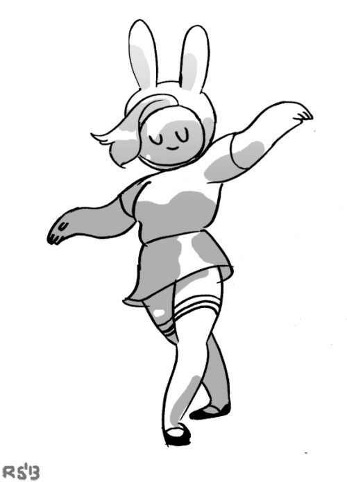
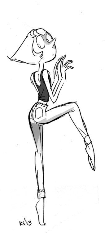
If Herpich’s style incorporates a blend of realistic human anatomy and cartoony features, Sugar’s is that to the nth degree. Her love for human anatomy bleeds through in her dancing sketches, as seen in images 3 and 4, which boast extremely dynamic posing that are rich for exaggeration in other examples. For an artist that delves so deep into emotional and physical realism, it’s astounding how much she is willing to push to an almost extreme level when it comes to facial expressions and body language. None of this is more evident than in her short film Singles, which features an entirely convincing display of human body language in the blobbiest, most absurd way. These are the sensibilities that bleed most into her AT work – extreme dynamic posing with characters that essentially bleed out of their own anatomy with emotion.
Concept Art
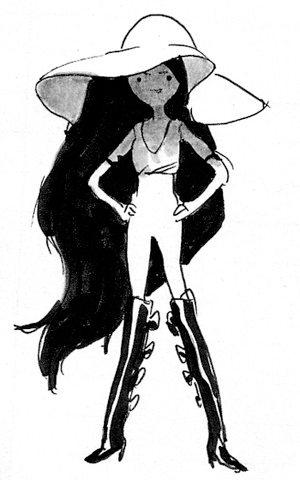


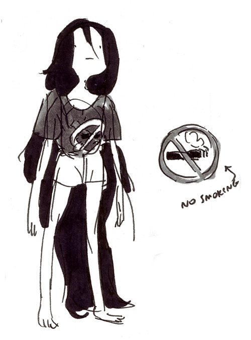


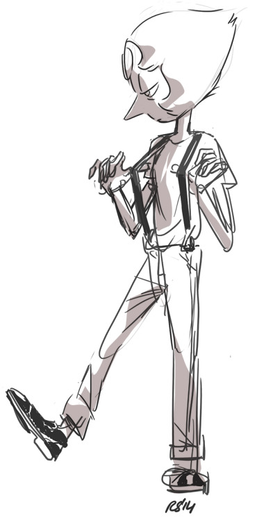
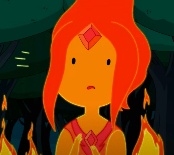
Various different sketches from Sugar, some of which develop design aspects for episodes (Flame Princess’s general look, Marceline’s outfits) while others are seemingly just drawings whipped up in her spare time. All of her general interests bleed through in these sketches – Flame Princess, Fionna & Cake, fashion and hair, and of course, Marceline.
Steven Universe


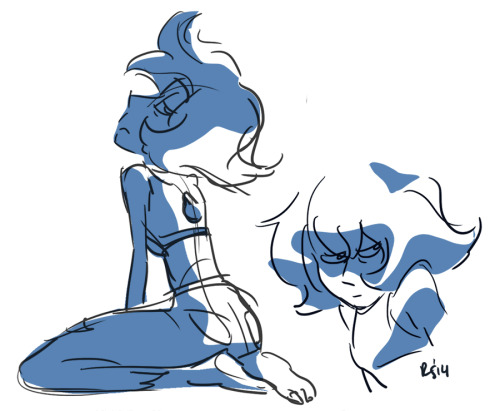


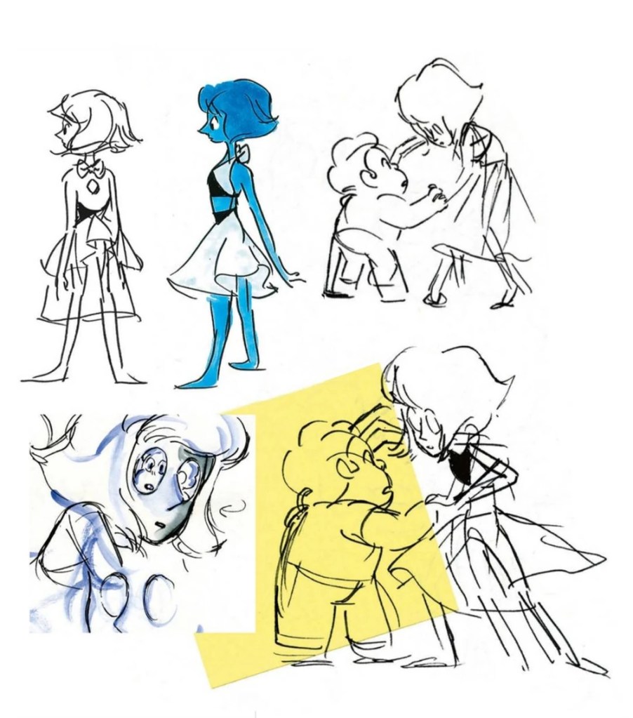
It wouldn’t make sense to do this without some Steven! The Sugar trademarks bleed through the most in these sketches – strong posing, stretched faces, expressive eyes, lowered mouth, anime accents, bulbous features, and a love for dancing and outfit changes. It’s no wonder that Sugar crafted Marceline’s most iconic outfit in What Was Missing.
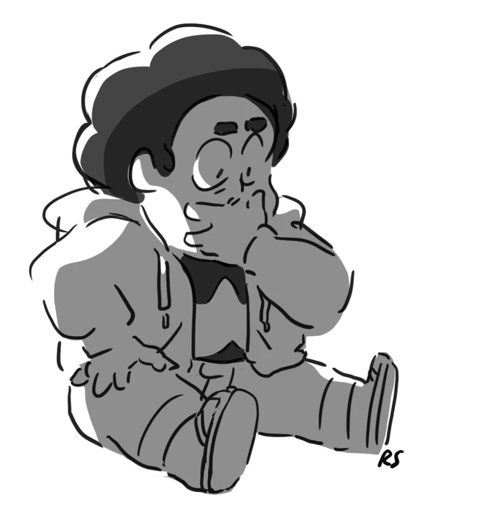
Finn & Friends
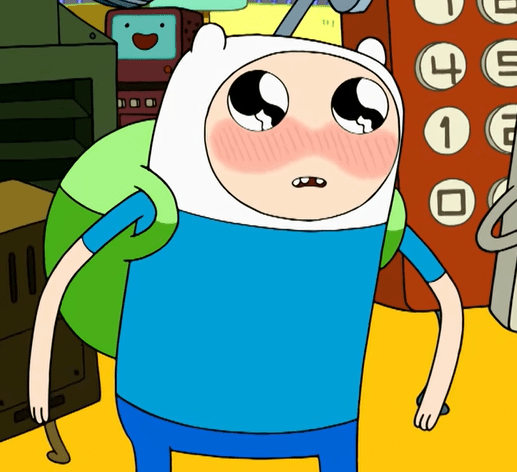
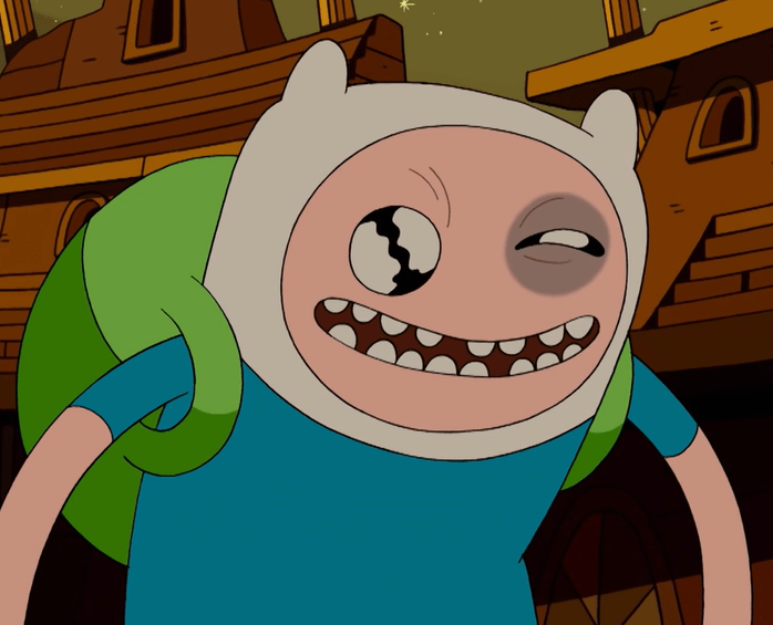


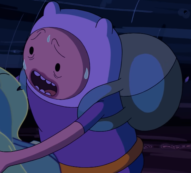
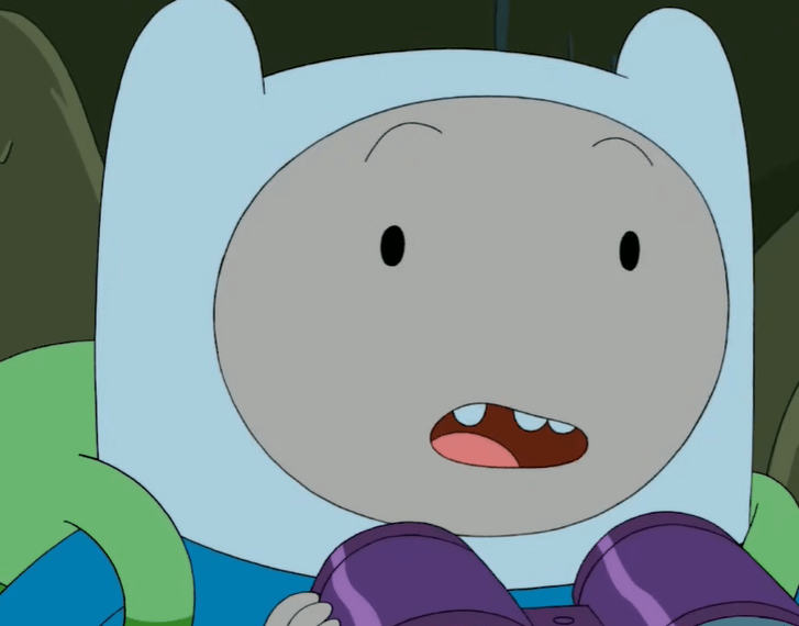


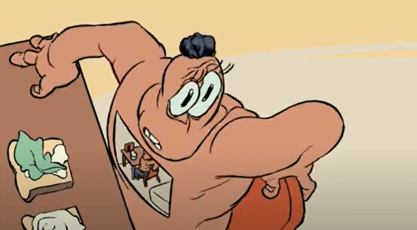
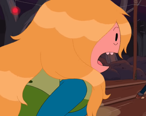
Talk about bulbous! Sugar’s Finn is the blobbiest Finn of all. Perhaps most distinctive are his facial features, which will range from the eyes becoming huge and glossy while the mouth shrinks, to the mouth becoming massive and complementing with equally large eyes. The mouth is quite possibly even more distinctive than those huge anime eyes, often morphing into a Muppet mouth that flaps off the side, mostly notably in the seventh image. Eyebags and wrinkles are common, though they usually drastically range in size and detail (different from the previously explored Steve Wolfhard who has a pretty consistent line weight and size for all of his accents). Of course, blushing and anime eyes are also staples, and that excellent sense of posing bleeds through in the eighth image. Perhaps most unique is how much Finn’s hat actually feels like a separate piece of apparel rather than a legitimate staple of his body in Sugar’s drawings. His face will often protrude outside of the hat, as seen in the fifth and ninth image.


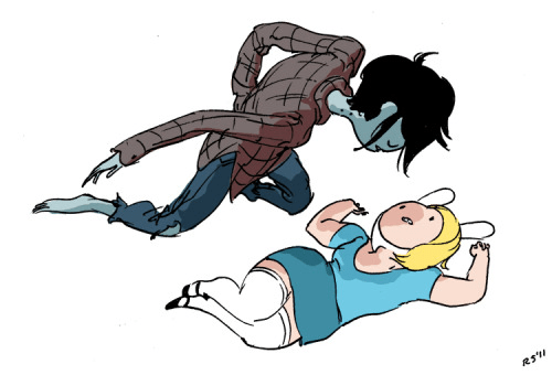
Jake isn’t usually a focal point in Sugar entries (even her sections during Jake vs Me-Mow were mostly centered around the Finn portions) but her touch is still evident when working with him. It’s a chance for her more simplistic attributes to shine, like the boomerang mouth seen throughout these images, which is usually more pushed than the typical bean mouth. He’s also a bit more segmented than the usual Jake, often having a clear separation between his back and lower half, as seen in the first and last images. Again, emphasizing that great sense of posing.


Some more Sugar shots of other characters. Mouths off to the side, boomerangs, tears, eye bags, and some of the most realistic hair physics you’ll ever see in the series. There’s plenty of implications of her styles in Seasons 2 and 3, but her contributions are really unmistakable from Season 4 onward. I think Jake the Dog is probably where her style shines the most, because she gets to work with eye whites and noses. That first shot is essentially just a Steven Universe character.
Promo Art
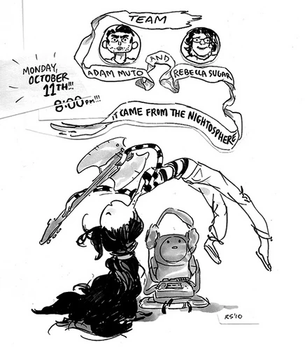


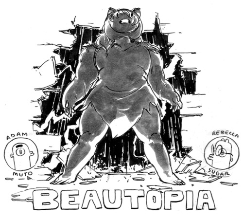
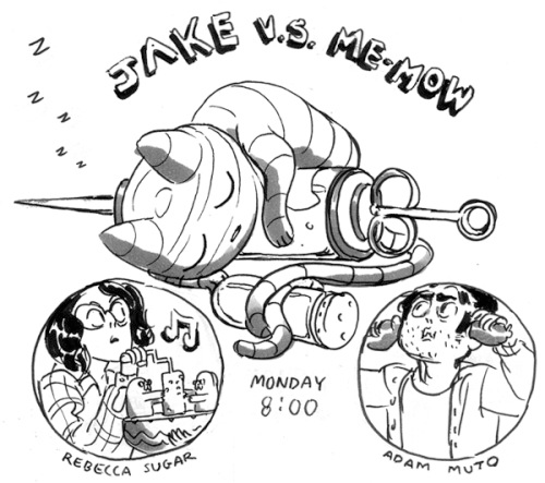
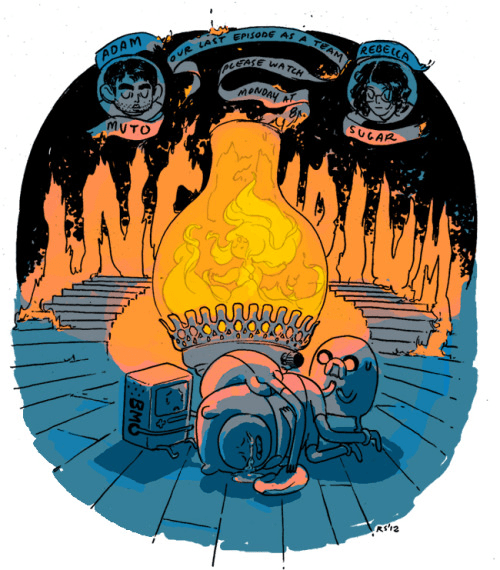

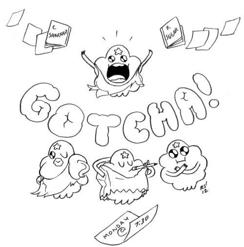


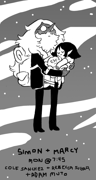
I believe Rebecca was the first board artist from the series to start doing individual episode promos. These promos range from detailed black-and-white drawings to full, vibrantly colored pieces, often without any type of backdrop. Sugar is also unique in having miniature versions of her and Adam Muto (and later Cole Sanchez, to a lesser extent) in all of her promos from Season 2-3. Tom Herpich would later mimic this for a bit during his time working with Ako Castuera throughout Season 2.
Storyboards
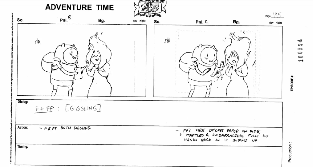
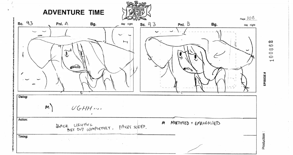
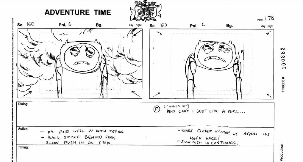


A handful of Sugar boards in all of their bulbous, emotional, sketchy glory.
Title Cards
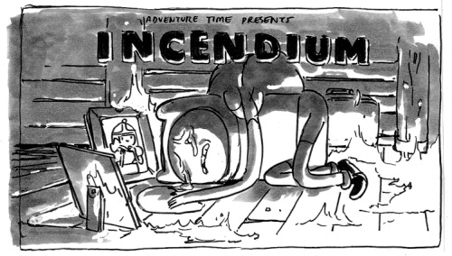
As far as I’m aware, Sugar has only designed the title cards for two episodes: Incendium and I Remember You. I could only find a good scan of the Incendium rough design online, while the I Remember You initial sketch can be found in Volume 2 of the title cards book from a few years ago. If anyone has a clean copy, feel free to send my way and I’ll add it above!
