
Muto’s been with the show since the beginning, and has become the head honcho following the departure of Pen Ward. I always have said that it’s kind of hard to understand Muto’s vision for the overall series when it comes to tone and direction. I think more than anything his love for the series additionally includes letting the artists do what they do best while also trying to evolve and expand the world and keeping the characters relatively evergreen. When it comes to boarding, it can be equally difficult to determine which sections Muto worked on unless it’s with someone very distinctive, such as Sugar. His style is so synonymous with the polished look of the series that there’s definitively overlapping synchronicities in style. Not to say that he doesn’t have his own flair, however. Muto’s probably of the best draftsmen in the entire series, churning out some really clean and neat drawings that bleed through even in his rough storyboards.
Art Style
Muto is a comic man most prominently. Most of his style can be analyzed through his two most prominent comic series – Tall Penguin and Future Boyfriend. I’m always impressed by how clean Muto’s linework is, ranging from very simple shapes to more complex designs that never seem to battle each other. Diverging from the hyperrealism of his counterpart, Rebecca Sugar, Muto lends himself to more cartoonish sensibilities. It’s easy to see how Adventure Time has impacted his own look, while also noting the nuances that bleed through in his own boards. Very wide faces, forced perspective, small slants for eyebags, the heightened detail mixed with extreme simplicities. Muto mainly avoids color in his artwork and sticks with a monotone drop.


Finn & Friends


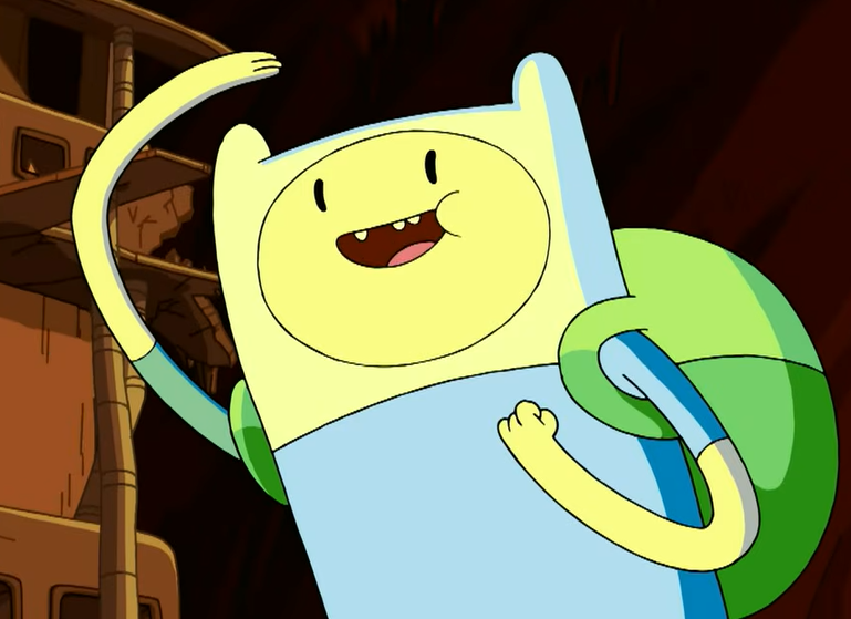
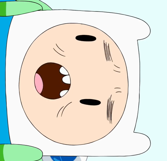
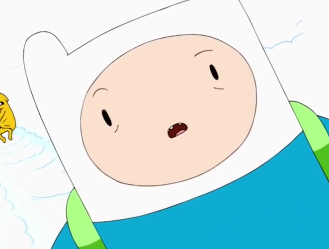

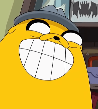
woof. This one was a toughie. Scanning through the earlier seasons, it’s really difficult to denote Muto hallmarks outside of the observation that “this bit was not boarded by Rebecca Sugar.” I don’t mean that to make it seem like Muto is an inferior artist, most of his drawings look great! It’s just somewhat difficult to distinguish his Finn apart from some of the many other iterations in the series. Something pretty consistent with all of Muto’s art is his wide-eyed characters donning slanty eye bags, which Finn takes on in the first and fifth image. One feature I never really noticed until I was researching for this write-up was the slightly curled dot eyes that will show up more so in the earlier Muto efforts, seen in the second and third images. Also, the thin, liney eyebrows in images four and six carry through most of Muto’s episodes throughout the series.


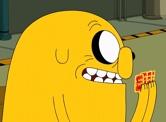
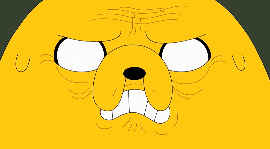
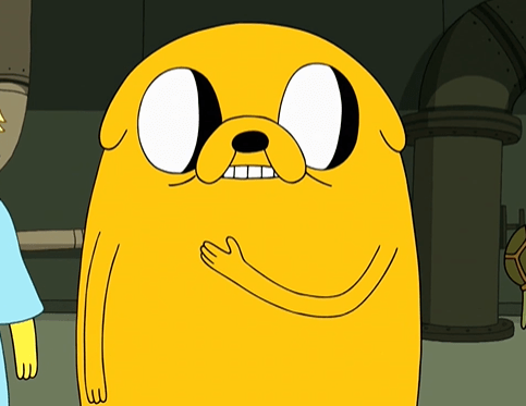
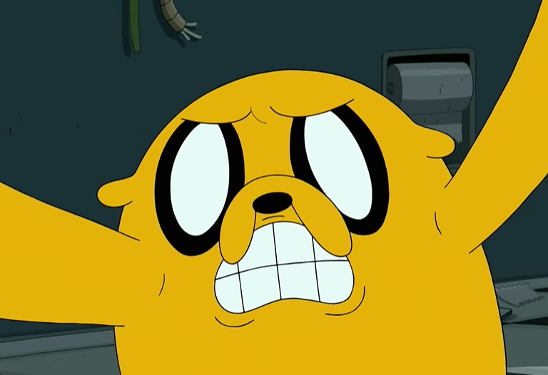
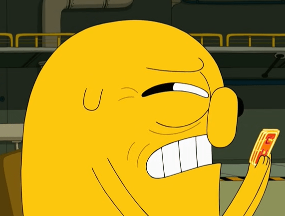

Muto’s Jake is way more easily recognizable than his Finn. Muto and Wolfhard have an unspoken competition for crankiest, wrinkliest Jake. While Wolfhard’s accents are noted by their smallness, Muto goes for a bigger, more expanded approach with Jake’s features, often making his eyes, nose, and mouth take over most of his body. These choices really get to shine in Daddy-Daughter Card Wars more than anywhere else. As seen in image 3, 7, and 9, Muto will often have Jake’s ears hang off his body as little nubs. Though, I usually associate this design choice more with Hanna K. Nyström.


This gallery of other characters is mostly just me realizing that Muto’s style is perhaps most notable on the dog characters, and his love for drawing them in side view. Again, a bit difficult to find some specific examples where an image really stands out as “yeah, that’s a Muto drawing.”
Concept Art
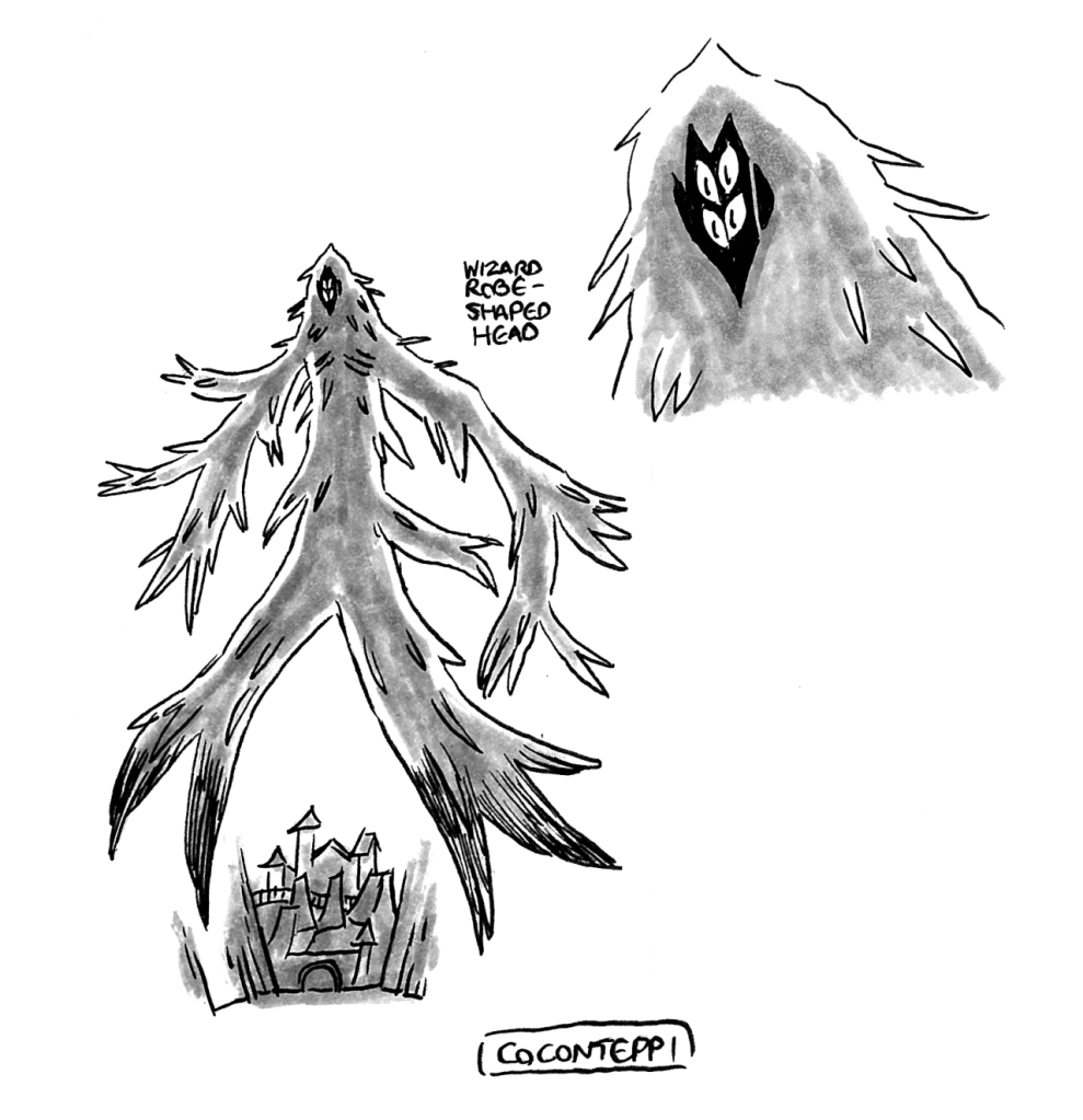

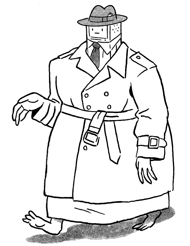
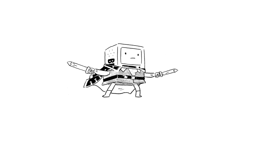

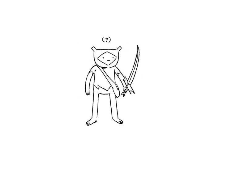


Muto regularly dips his toes into conceptualizing ideas for the series. A lot of these have made their way into the show verbatim (Finn and Jake Banana Guard disguises, Nightmare Princess, BMO and Ice King’s business outfit) while others were expanded upon by other board artists (Fern’s design).
Misc.


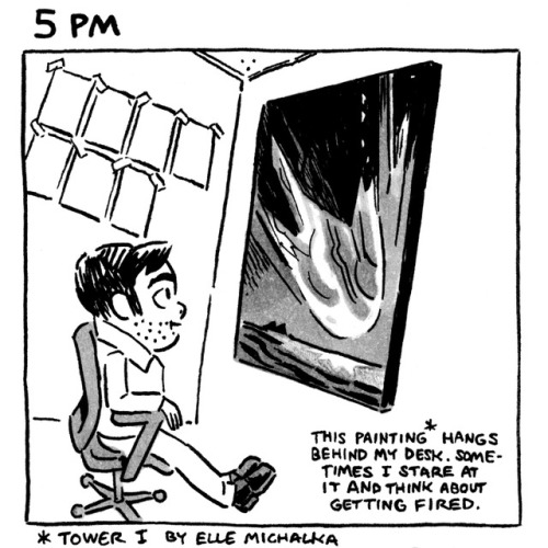
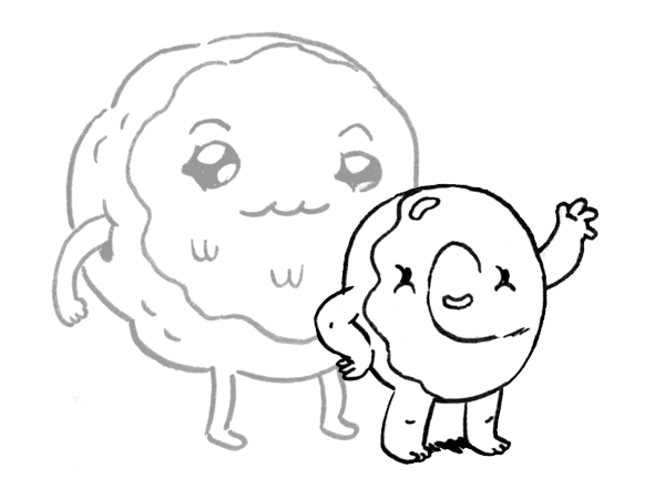
Muto has whipped up a lot of gift drawings and non-episode promo images, mainly towards the original show’s climax. Like most of his art, they’re done in his traditional black-and-white style.
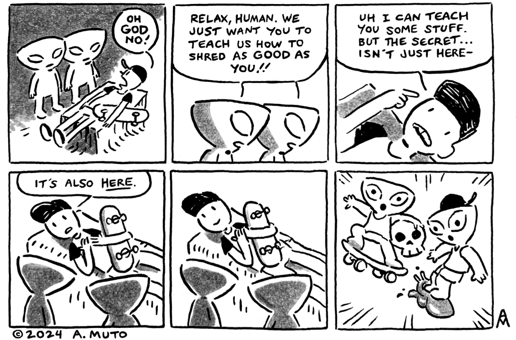
Storyboards
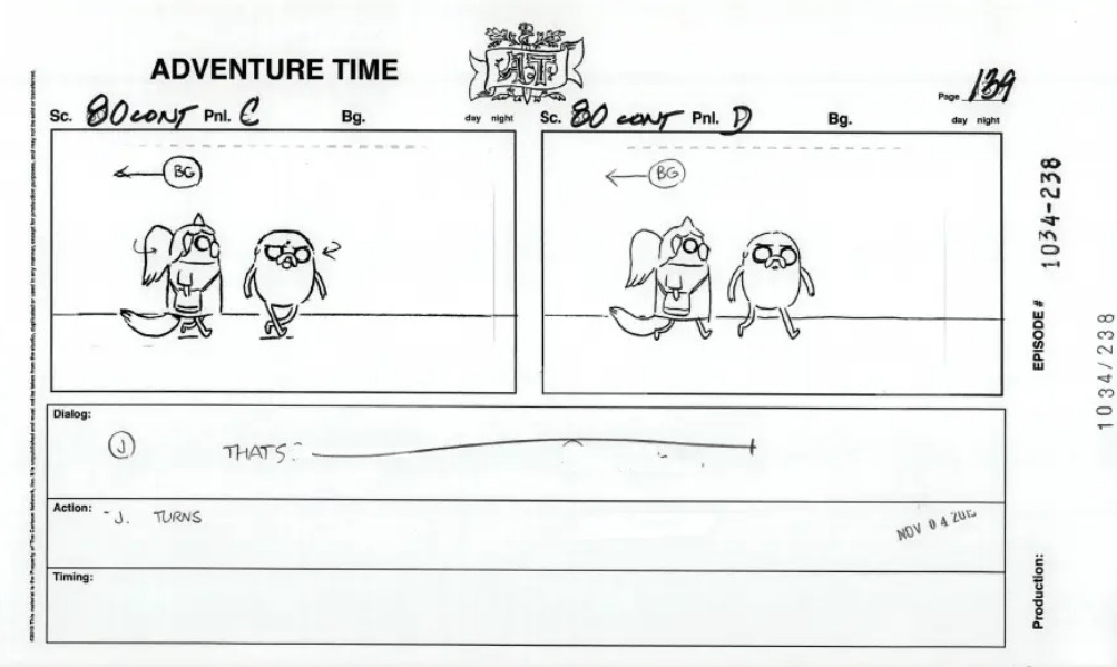


Some Muto boards, showcasing both his love for added details, thick and defined outlines, and sideview pups.
