
What up, kiddos! Got a really cool notification the other day – AT Reviewed has surpassed 500K overall views! That’s really astounding to me – this started as a small project that I wasn’t even sure I’d get that far on, and snowballed into something that people seem to dig. So a few new updates – for one, it’s about time I got rid of those pesky, tiresome dermatologist ads that pop up after every paragraph, so no more intrusions in your reading experience! I also bought the domain, which should hopefully make it a lot easier to access the site.
Since there’s probably some lag time between seasons, I wanted to start a new little project. The new season brought a lot of new faces to the table, and while these fresh new voices helped to breathe new life into the AT world, it did make me miss the original team and how much I had become invested in their unique styles. That’s not to say that the new team doesn’t have their own voice, but it became much easier to detect the style of AT‘s alumni primarily because they had so many opportunities to showcase it in the course of nearly 300 episodes. And personally, part of the reason I wanted to start this blog was to highlight those individuals touches.
It remains very, very cool to me how Adventure Time brought together indie artists that mostly didn’t have a ton of professional experience or a style that seemed to mesh with the current landscape of children’s entertainment and unified those sensibilities to make way for something completely unique. So I wanted to pay tribute to that crew by doing this little Artist Spotlight series. As always, I have no idea how many of these I’ll realistically tackle over a period of time, and if there’s new AT content, those reviews will take priority. And as much as I’m inclined to talk, I’ll try to keep commentary relatively light. I want this to be more about celebrating the work of each artist (in a, by no means, comprehensive way) rather than to analyze writing or art style. But there’ll be a little bit of that too. First up is my personal favorite board artist, Tom Herpich!
Art Style


Herpich is one of the more detail-oriented artists working on the series. He often draws humanoids and beasts with various complex pieces of armor, clothing, accessories, etc. He also has a really solid combination of contrasting styles: body proportions are very detailed and close to human anatomy, while other features, like the eyes, nose, mouth are exaggerated and cartoonish. His style of writing is very much in the same vein – overly goofy humor wise but with a realistic sense of darkness in dramatic moments. Like most of the other artists, it becomes very apparent in seeing his own sensibilities bleed through from both a visual and tonal perspective.
Character Design

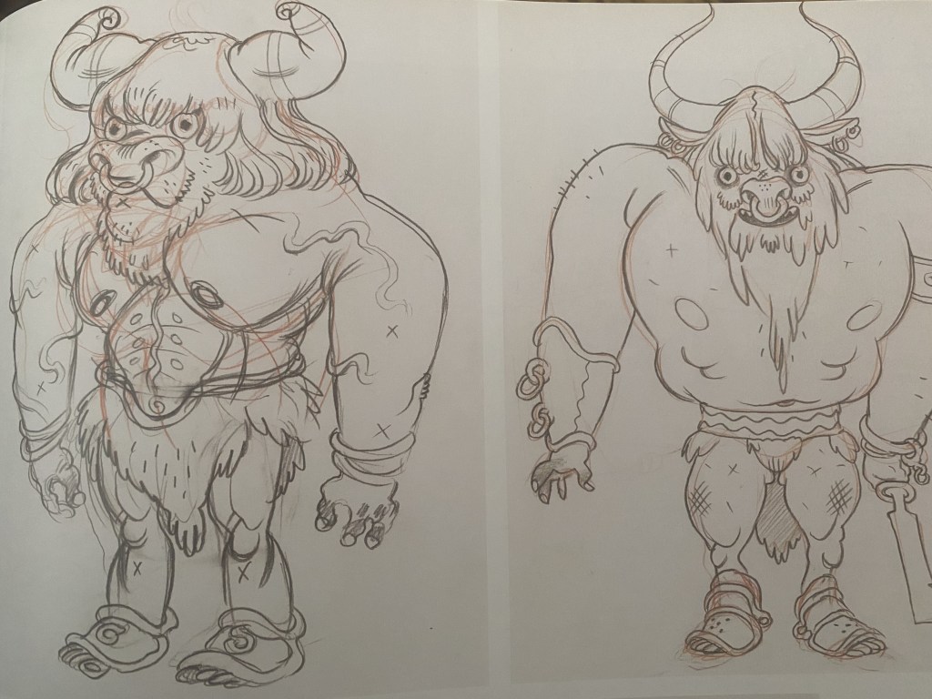


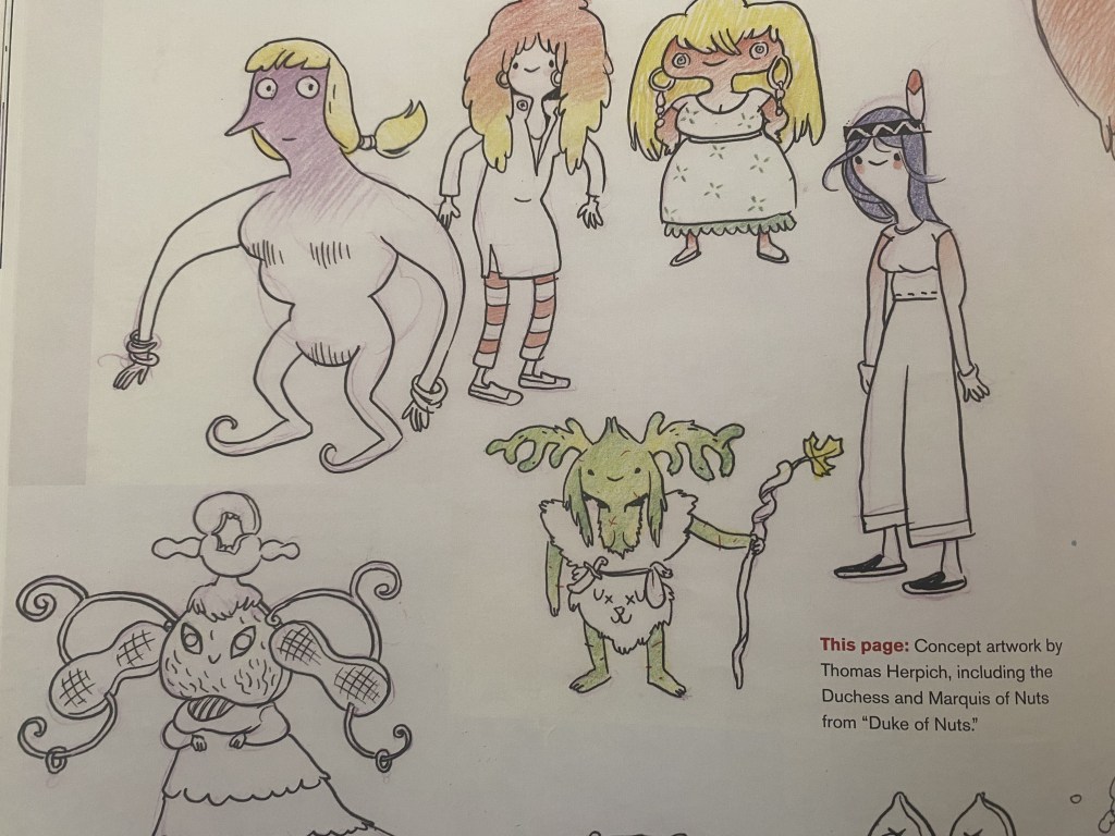
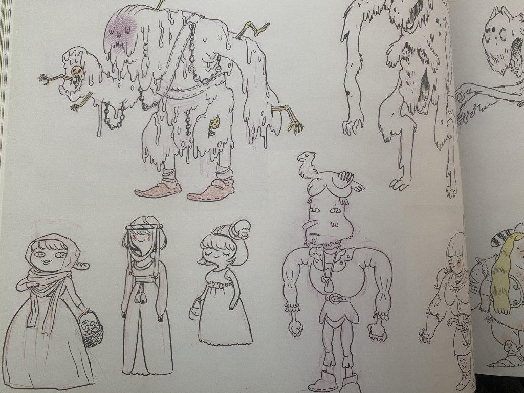


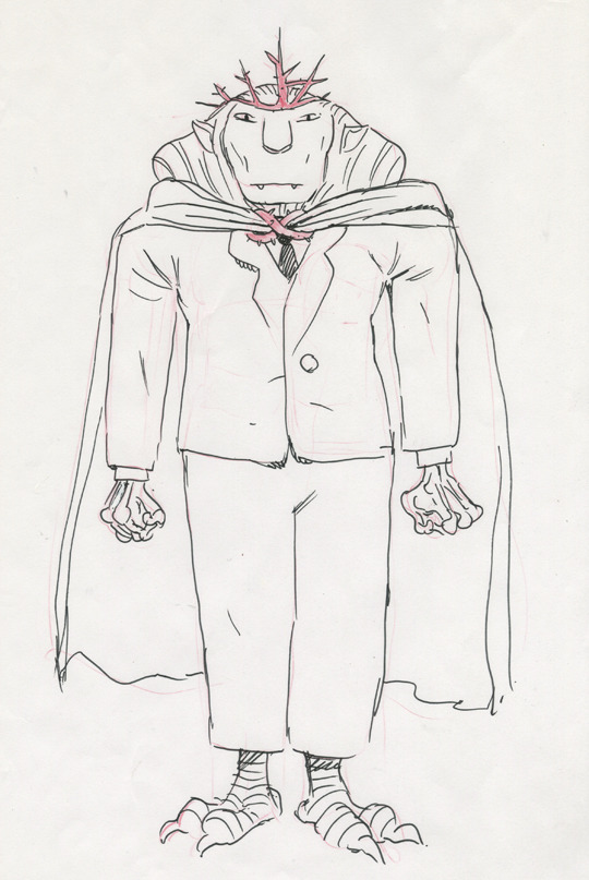


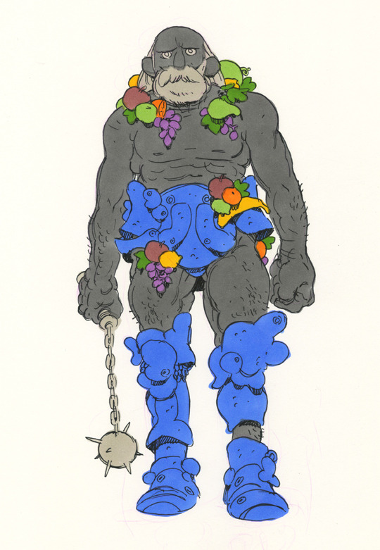
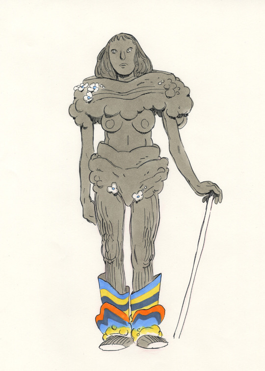
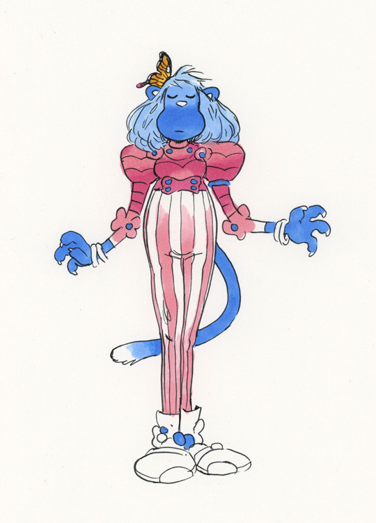
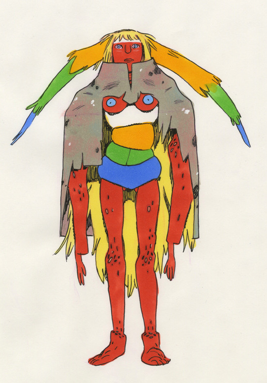
That love for detail really comes out in his character design work. Herpich started out as a character designer and would originally make designs overly complex in a way that didn’t really translate to the mostly simplistic style of the series. In an interview from the Art of Ooo book, in reference to Mannish Man’s initial designs, Herpich states, “I didn’t realize at the time that all this stuff was impossibly complicated, plus strayed so far from the original storyboard drawings that it would’ve all had to be reboarded to use these designs.” It’s interesting to see how the series shaped Herpich’s artwork while also seeing how his style has influenced the designs of monsters and magical entities.
Finn & Friends

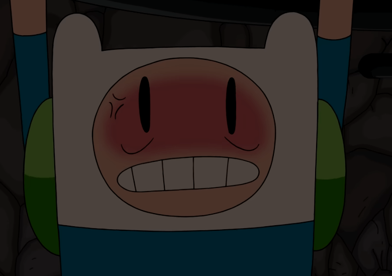


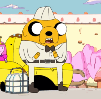
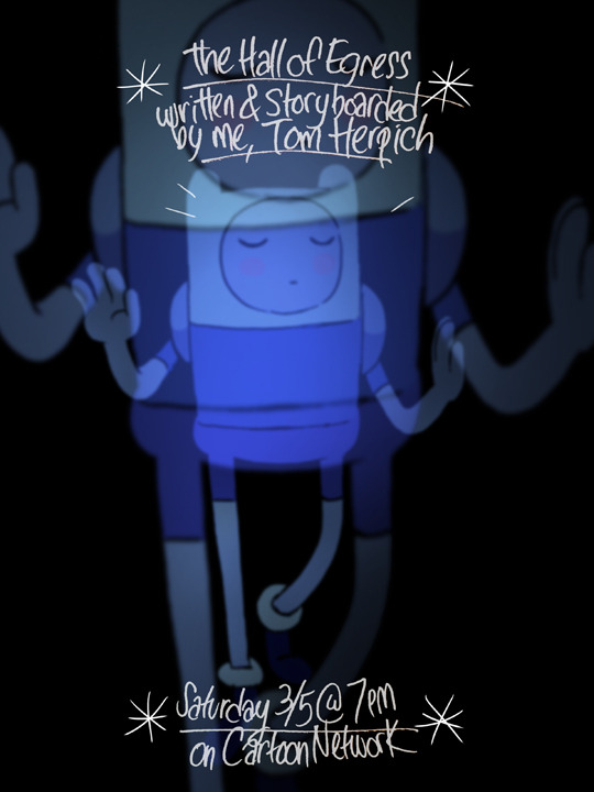
Herpich’s Finn is most distinctive in his more oval-than-round eyes and the far distance apart from the mouth, as well is very round and large teeth. Sometimes Finn has a full top row of teeth with Herpich! He loves to draw exaggerated expressions with Finn’s teeth and mouth, seen in the top two rows (this type of grimace is Herpich’s specialty). It’s easier to notice his style in full force from season five onwards, but the oval eyes are always a dead giveaway, as seen in the bottom left still from Go With Me. Similar to the tone I was discussing above, Herpich has a very dualistic approach to Finn’s character. He’s often at his dumbest and goofiest from Herpich’s perspective, but also prone to his inquisitive, as seen in episodes like The Visitor, Hallf of Egress, and The Tower.

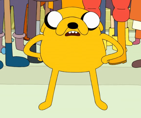

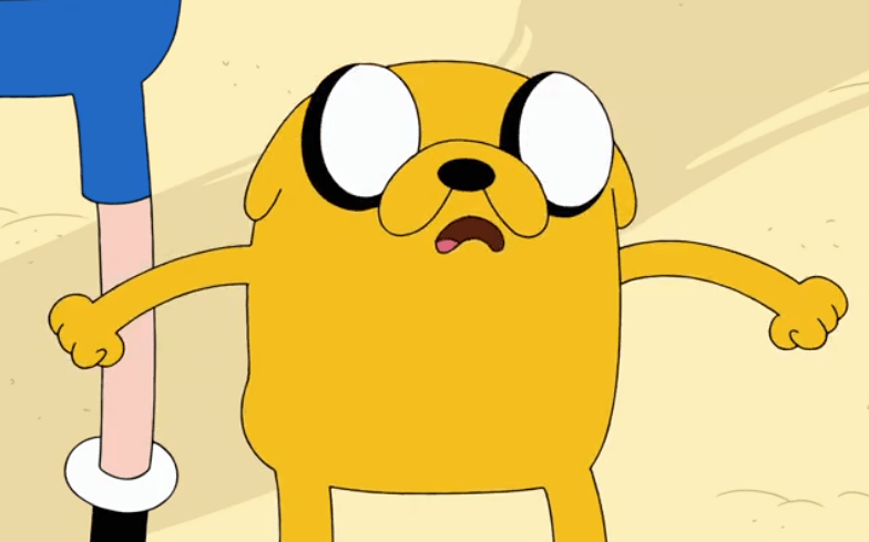

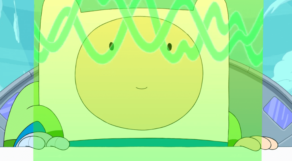
The oval eyes occasionally find their way into Jake’s design, though more recognizably are peaking over the top of his head. Herpich is also one of the few board artists that consistently draws Jake with two ears present, even within the standard 3/4 perspective. Herpich’s characterization of Jake is a bit less pronounced than his partner Steve Wolfhard’s is, with Herpich seeming to excel more within Finn solo journeys.


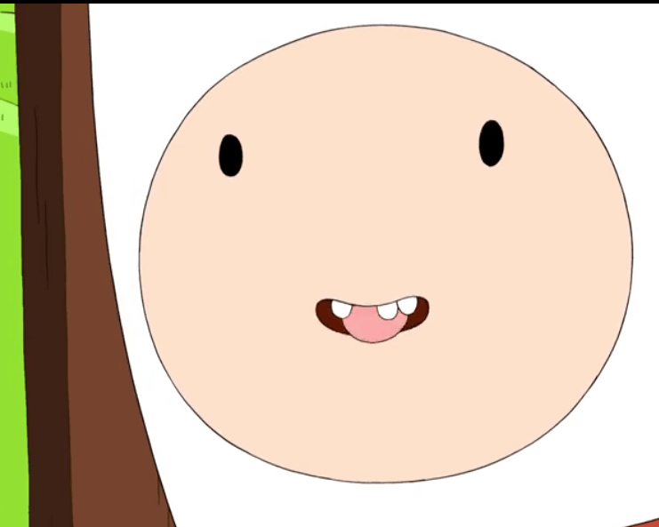
Some other examples of scenes and characters that were boarded by Herpich. A lot of his hallmarks can be seen across multiple characters: oval eyes, large, rounded teeth, mouths that are very distant from the eyes, eye blushing, and the oval-shaped grimace I mentioned above. Herpich will also sneak his desires for more detailed human anatomy in, as seen in the top left screenshot of Martin.
Promo Art


Examples of promo art that Herpich whipped up.


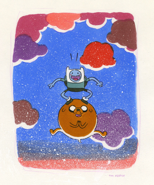
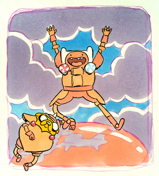
Herpich’s solo Finn episodes are some of my favorites, and that goes for the promo art as well. I really love the bold color choices on all of these, with these three in particular feeling almost like an interconnected series.

Miscellaneous promo art, with the second and third promoting season seven and the series finale respectively. The first image was to promote the series returning from a long hiatus between Daddy-Daughter Card Wars and Preboot. It’s one of my favorite AT images produced outside the series – has so much simplistic charm and love instilled into it.
Storyboards
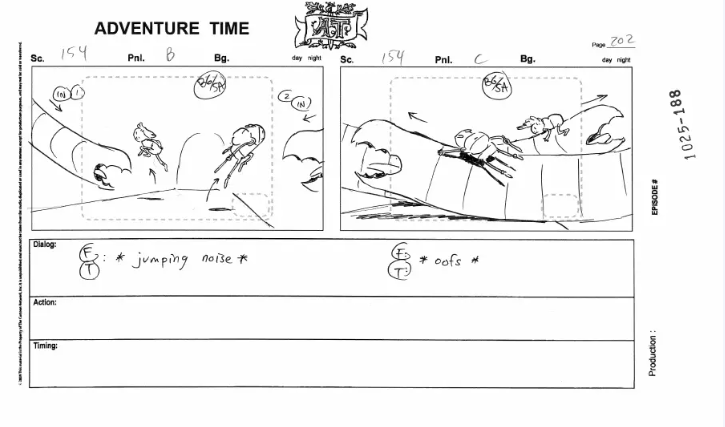
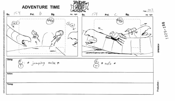


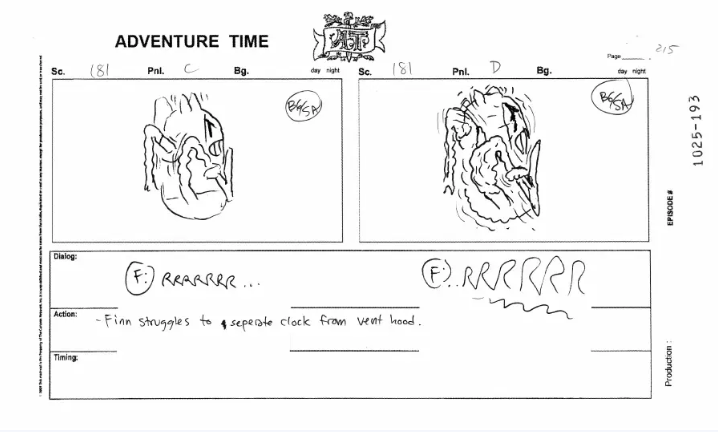
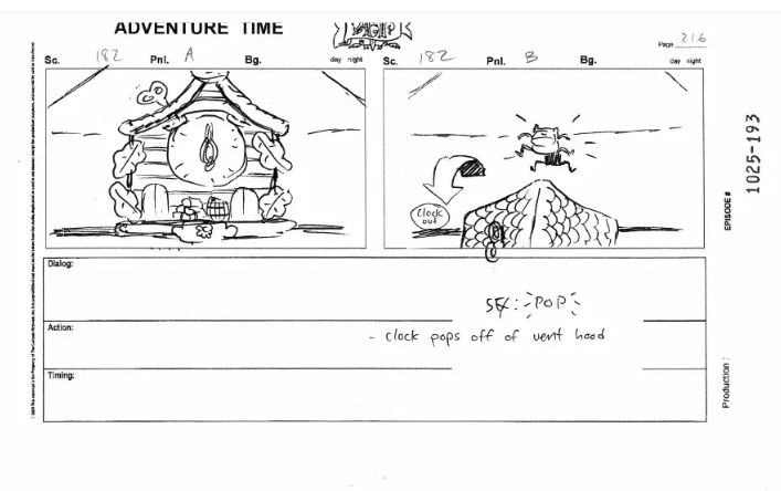
Herpich attention to detail really permeates through his boards, and he’s conjured up some of the most fluid action sequences in the series. The above is from Dentist – a lot of malleability with the characters as well. I love the realistic physics of Finn’s hat moving – something mostly unique to Herpich.


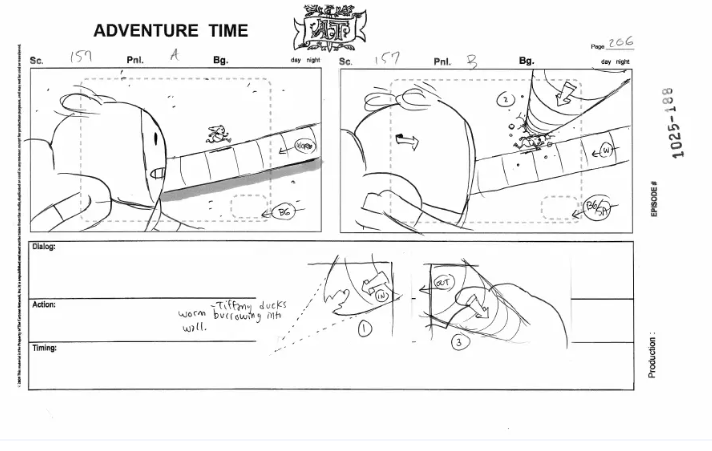
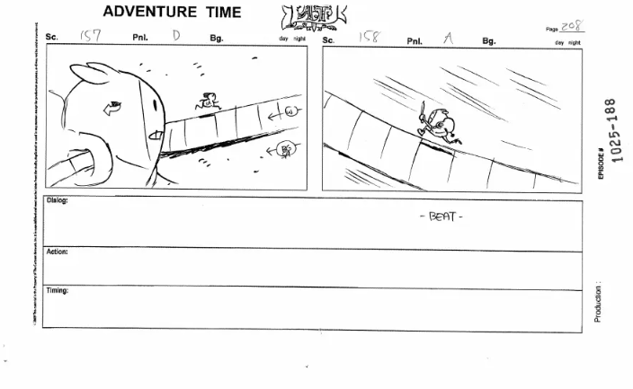
Another high-stakes sequence from Walnuts & Rain. Really elaborate shots and camera movements for a storyboard as well – AT really utilized storyboarding as an effective method of directing more so than most animated shows in the industry.
Title Cards
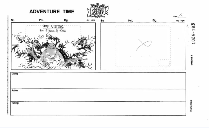


Herpich is also unique in that he’ll create rough sketches for title cards within the storyboards, something that is not required of him, but he’ll add anyway. Most of these don’t end up being used for the final designs; they all commonly feature characters facing toward the screen.

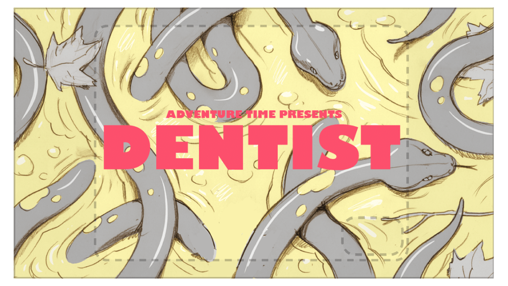


The actual title cards that Herpich has designed are day-and-night from his rough sketches. Most of them don’t feature characters at all, but shots that build environment for the episode itself. It’s a rare opportunity that allows Herpich to work on background design versus his usual responsibilities.
And that’s it for this one! I hope that this was an enjoyable expedition, as I mentioned, I plan to do more of these in the future. If there’s any aspects that are lacking or could be improved, I’m happy to hear your suggestions! Will keep with the board partner model and tackle Steve Wolfhard’s contributions next.
